Physical Shops, Online Shops And How They Relate To My Project
- Callie Pocock
- May 14, 2018
- 12 min read
Updated: Jun 3, 2018
Bubble t Cosmetics Website Inspiration - https://bubbletcosmetics.com/
I found this website by typing into google 'bath bombs' and luckily, this site was one of the first sites that came up. As soon as I had a look at this website, I was instantly so interested in the company. The colours, the layout, the professional images, the price didn't really matter to me after seeing the website. I knew instantly that this is a professional and trust worthy website from the first look.

Looking at the navigation bar across the very top of the website, their are drop down lists created to show various other categories within a category. I think this is a very professional idea that I may be inspired from for my website also. On the drop down lists, there are little motion graphics showing some products in that category.


As shown above, this is the home page that you are faced with as soon as you go on the website. It looks colourful, well laid out, professional and organised. It is not too cluttered and it is user friendly. There are three different categories shown at the bottom to guide you to the section of the website you might want to be and there are also tabs up the top which takes you from page to page. The pages are 'bath and shower', 'skincare', 'bundles', 'sale', 'contact' and 'blog'. Within each of these are subcategories and pages to choose from for example when you click on the skincare page, their are various skincare options to choose from such as hand sanitisers, hand cream, lip balm, body lotion and body cream. I think this is a very professional way to set the page out as it is easy and simple enough for anyone to use.
I love the background image on the main page too. I love the rainbow pastel colour explosions that the bath bombs have created in the bath, I love the neutral colour of the bath bench that the bath bombs are sitting on and I love how you can see the bath bombs in the foreground of the photo and then the bath explosions in the background. It tells customers exactly what the company is, what they do and sell just by the first image shown. This gives the website and the home page context.

Following on from the main image welcoming all customers, there are three different categories to choose from once you scroll down. There is the bath and shower section, summer fruits bubbles and tea section and finally, the skincare section. Having these three sections makes things easier to navigate on the website, organised and creative.

Once you click on the bath and shower section, this is what it looks like. You are greeted with a big and bold bath and shower sign so you know that you are on the right section, there is then a little bit of text underneath saying what is in the bath and shower products and that they are all free from paraben. The background image is a lovely pastel backdrop which is not too over powering over the words or other products, it sets the page really nicely.
Underneath this is a little sort box option where you can select various different options as shown below. This just helps you find what you are looking for a lot quicker and more efficiently.

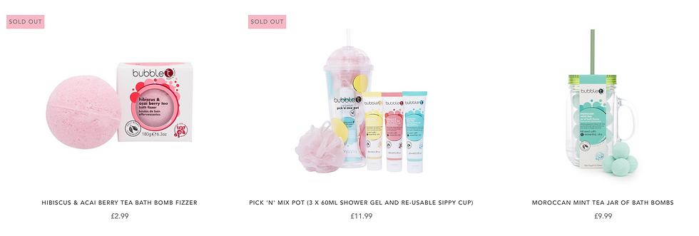
The image shown above are some of the products I found within the bath and shower category. I love the font of the title of each product and how the price is shown below that and I also love the coloured background of the text saying 'sold out'. The colours go really well together and the product images look really professional. I love how the company groups products together and sells them as a bundle as a cheaper option.

I love the layout of each product where there is the title of the product, the price and then the star rating and number of reviews. This is a clear layout and looks really good on the website. Looking at the image, I love the how the background is subtle yet effective due to it reflecting the pastel colours on each of the products. I love that the colours on each product reflect the scent and I also love the packaging design. I think the font and logo of the company is really simple and effective and I love the colours and bubbles shown on the product packaging to show what the product is before reading.

On the summer fruits bubbles and tea category, everything is baby and dark pink. I like that everything is light and dark pink because it shows you are within a certain category of products. The products fit within this certain category because of the scent. There is a different backdrop image at the top that greets you to the category and it is also using light pastel colours that fits the rest of the website. Again, following the same theme, there is the title in bold at the top of the category with text underneath that entices you to buying the products by talking about the qualities and ingredients that the products use.
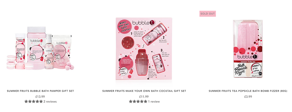
The products shown above are some of the pamper sets that is offered. I like how many of the products and items are grouped together where you can see a wide range of different sizes and proportions. It looks pleasing when looking from afar.
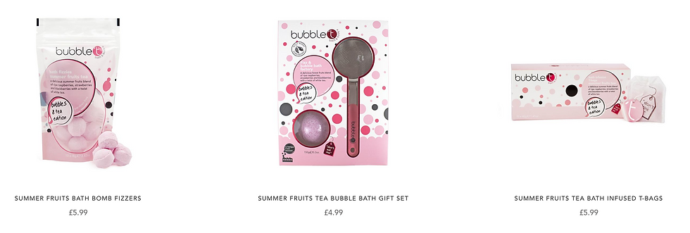
Here are some more products shown, they are all summer fruits hence the category and colour and they are all a wide ranged variety of different bath products.

Finally, shown here a three varieties of bath powder fizzes. These three colours are the base colour that the whole website uses and they are the three main scents found on the business website.

This is the very last category shown on the home page of the website.

Here is one of the set collections shown at the end of the category. The website usually has a couple of sets at the bottom of each collection, for people who want to try multiple products but do not have money to buy the products individually.
I personally think sets and collections or bundles are a good idea for people who want to buy a set for a certain birthday or celebration. It is a good way for people to buy and experiment with multiple products that they like the look of and might want to buy again.

This is one of the body lotions which has currently sold out. The packaging looks original and creative. The bubbles on the packaging not only matches the name of the company but it also shows what the product is.
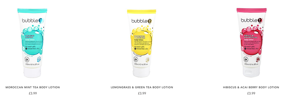
Shown above are body lotions. There are also body creams which are in similar packaging. Eve though there is only three scents and three different variations of each product, Having only three scents matches the whole website and theme of the company so it works even though there is only a small range.

Here is a lip balm set. The lip balms are sold individually also but incase you want to try all three balms, this set saves you on money which is a really affordable price. That is one other quality of the website I really like, the fact that the prices are not expensive yet they are very affordable. £2.99 for a lip balm I think is a very good price and is something I think I would definitely be willing to pay.

Back to the home page, after the three different category choices are given, there is an about us section which basically tells the customer what the company is and does and sells. Incase the customers didn't already know what the company was by the colours, the images and titles, the about us section gives the customers a more in depth understanding of what the company tries to achieve.

Next on the home page after the about us part, is gifts. These are special bundles that customers may be interested in when they like multiple products on the website or when they want a nice bundle of products for a gift or special occasion. These bundles are what the company has put together to make shopping a whole lot easier for yourself or someone else. Putting the time and effort into making these bundles and special offers, is what will intrigue more customers.

Next on the web page is this little banner. This banner talks about how the products are paraben and SLS free, how the products are against animal cruelty and how they are all homemade using natural ingredients. This also is what a lot of people will be interested in due to them not using any harmful ingredients or chemicals.

Shown above are all of the different elements of the products that they are most proud of. For example, every product uses essential oils, they are against animal cruelty, they are paraben free etc. This is the companies most proudest achievements that they are able to maintain throughout their products.
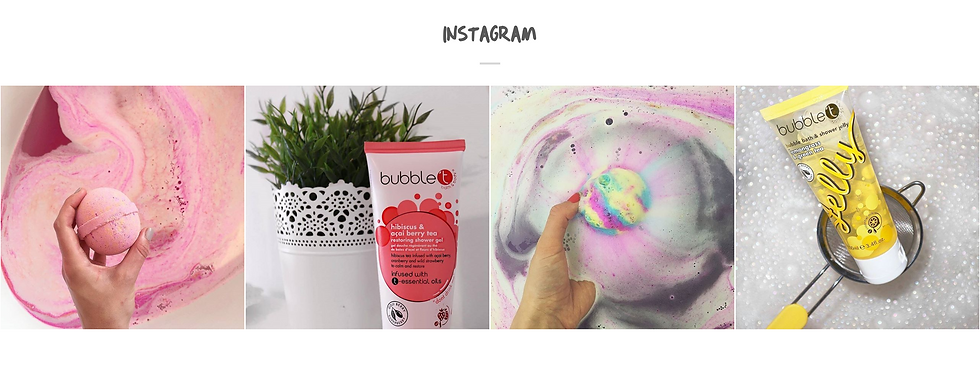
Below the most proudest marks that the company has, they show their Instagram social media. The images look attractive colour yet they look professional. The images are simplistic but shows each of the products including what the product looks like in use. This will definitely intrigue people into the Instagram social media.

Here are the stocklists of all the companies that bubble has teamed up with. For example, Superdrug, Waitrose and Argos they have teamed up with to sell their products due to these shops being so popular and successful. They know that if they team up with these companies, their products will be sold instantly.
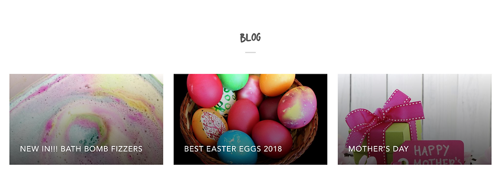

This blog post shown here, is one of the many blog posts that they have done to talk and introduce you to their bath bomb collection. The blog talks you through briefly about the brand new bath bomb fizzers that they are introducing and it shows you each one. They have kept the writing to a minimum, introduced plenty of pictures and captions and wrote about the necessary information. This is what ]the customers would be most interested in reading and so this is what they have done.

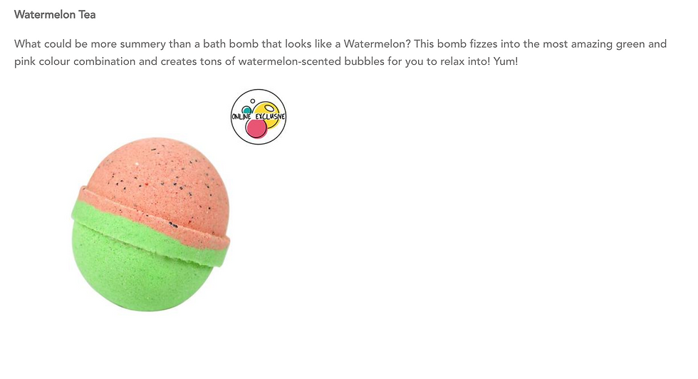

Shown above here, is the bottom footer for each page on the website. It shows you how you can become a wholesale customer, it gives you many links to be able to contact and get information about various things from, you can subscribe and put it in your email to hear about special offers, you can get links to their social medias and finally, it shows you the different ways you are able to pay.

Shown above here is the little notification banner that shows every time someone buys an item. It makes customers feel happy that they trust the site and that they are not the only ones buying items.

On the website, they have also added a special prize draw in which you can put in your email and pin the wheel to earn yourself up to 50% discount on a product. This makes shopping a whole lot more fun and exciting.

This is what you see if you click on the contact page. It gives you all of the necessary information to be able to send an email or text message about enquiries or even visit them themselves. This piece of information is necessary incase anything goes wrong or needs replacing.

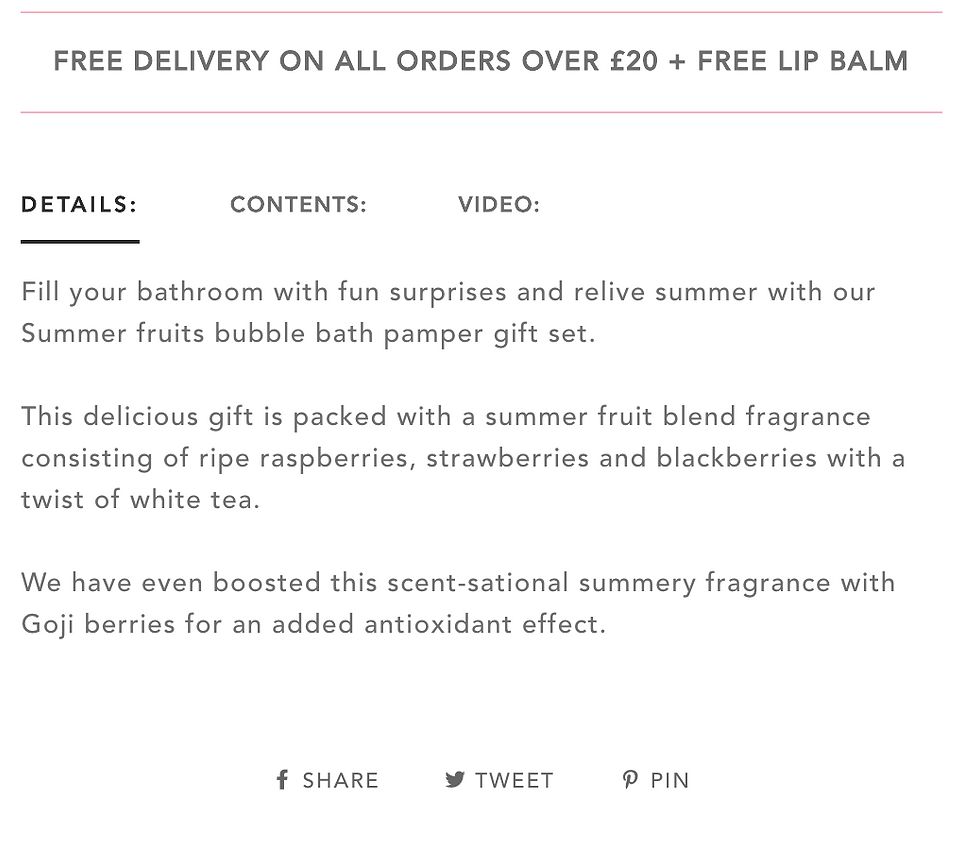
These images are what you see when you click on a product to buy. You see the product title, the product code and the product price. You get to select the quantity of the items you want and then you can either add to wish list or add to cart. You can the information that you can have free delivery when spending over £20 with a free lip balm. You then get the details including what is in the bundles and gift sets, contents and a video of how to use the product. Scrolling down further, you get to see the star ratings and customer reviews and related products incase you might like them also.


On the sale page, we see that everything has a sale label on and that the original prices are crossed out and has a new price next to it. I think the prices are very reasonable and worth it due to the quality of the products. It is certainly a lot cheaper than Lush.

As a conclusion, I like this company very much because they are different than anything else already in the industry. Yes they sell bath bombs and mini bath bombs and bath potions which myself and other companies sell also, however, they have made their own products and have taken a twist on things. Everything is homemade using only natural and non-harmful ingredients. They have created their very own logo and business name, they have their own packaging, scents and they have partnered with other big organisations like Argos and Superdrug. Their website is colour co-ordinated and reflects who their company is and what they do. Researching and analysing this website and social media links with my business as I am taking inspiration of layout and colour co-ordinated themes for when I come to creating my own website and social media pages for my business.
Lush - https://uk.lush.com/

I am going to be looking into depth at the Lush website to see their layout, images and branding and I am going to compare this to Bubble so I can have a strong understanding of what I want to do for my website.
To start off Lush's website, you are greeted with a black navigation bar across the top of the page with a big image in the centre. This is very similar to Bubble's page layout, where they have the navigation bar across the top of the page and a big image underneath, only Lush does not have one colour scheme with a few colour combined, they mainly just stick with browns, greens and greys to have a more natural, homemade feel to the website rather than a pattern or specific three colour scheme like Bubble. In my personal opinion, I much prefer the colour scheme that Bubble has as it looks much more organised and professional rather than a little messy and confusing.

Once you click on find out more on the home page, it brings you to this page where you can find out everything you need to know about the Lush Spring Prize.

Shown above and below are screenshots showing all the blogs that they have created for you to click on and find out about the Lush Spring Prize. Each blog carries out information about a different part of the prize. They explain what the prize is, who won it, what they did and much more in each of the blogs shown.


When you scroll down on the home page, some blogs are shown from spring prize, some blogs shows you the products in action, and others tells you about the events and activities that Lush has taken part in.

Scattered between these blog posts are new released products. It feels the spaces on the page and shows the customers all new releases. I like how the title font is all the same showing it matches on the page that is full of colour.

Having cover images filled with lots of colour as the main image for your blog posts, intrigues the customers to read and find out more from the images and colours shown.

I like how their are no spaces on the page. Images, blog posts and advertisements make the page pop with excitement as their is so much going on.

As usual, the footer is a very dark background colour with white writing talking about helpful information and links, different payment methods, their social media pages and help. You can also enter your email and sign up for newsletters.
I think the main home page is very busy and pops with colour. I think the Bubble company's website looks far more organised and professional as everything is navigates easily and split into categories guiding you from page to page whereas Lush's website, throws information and products all at you at once. Both look nice in their own unique ways which separates them from the industry but when I come to creating my website, I would more likely take inspiration from the Bubble website rather than the Lush website.

Once you click on the products button on the navigation bar, you get lots of drop down lists where you can click a category or product to find exactly what you are looking for. This is very necessary when you have lots of products, blogs and things to show. For my website at the minute, I have laid it out like merchandise where you have the main image banner showing what the business is and then all the products shown when you scroll down. Because I do not have lots of categories and types of products at the minute, this is the best way to fill a page and attract my audience. When my business becomes more successful and I start creating more products to grow the business, I will look into doing drop down lists like this to navigate my customers through my website.

This is a bath bomb category page where all the the bath bombs are shown. The background images for the blogs and pages are really colourful and thought out. I like how the image is a background image as there is no foreground subject that stands out catching my attention however, it is still a really attractive image even in the background.

To summarise my research into Lush's online shop, they have made their shop very unique to them. It is busy, colourful, engaging and fun for an all round audience. The products are very expensive but because the company is so trust worthy and professional, people are willing to pay the price. I prefer the layout of Bubble T's online shop as it is a lot more user-friendly and easy to navigate rather than Lush which is a little more complex. I think compared to the website I have created now, I have followed the route of simplistic, professional yet somewhat unique and creative with the colour scheme. I mainly followed the inspiration of Bubble T.


Comments