YEAR 2 PORTFOLIO
Photography Shoots
I made these contact sheets in Photoshop by clicking File, Automate and Contact Sheet 2. It has two lines instead of the number 2. I then chose my folder with all my images in or you can select all of your images by holding shift and clicking from the beginning to the end or hitting cmd and clicking. This then made contact sheets which I saved as jpg's.
https://helpx.adobe.com/photoshop/using/contact-sheet-pdf-presentation-cs6.html
This site shown above really helped me to figure out how to make my contact sheets.
What is the point in contact sheets?
Well, the reason I decided to create contact sheets for every shoot I have done, was to show to show my experimentation. There was so many wrong settings and wrong angles and problems that occurred on my shoots, it would be a shame to leave all of the hard work and struggles out of my project. By having and analysing these contact sheets, I can reflect and see where I went wrong and how I fixed it but more importantly, I can prove just how much work I have done to get to my final outcome. It is all part of experimenting and testing.
To start off my shoot, I didn't like any of my photos. They was either too dark or too light. As you can see on the right, half of my images was taken up by a dark black strobe and I didn't know why. To not have this strobe anymore, I played around with the ISO and it had fixed it. I lowered the ISO to 100 instead of 800.
Next, because I was getting too many dark harsh shadows, I decided to change my lighting setup. I went from using one spotlight in front of the product to having two lights with soft-boxes. One directly in front slightly looking down on the product which is the light I connected the hot shoe adapter to and the other light, was directly behind the backdrop which also had a soft-box on it. This worked as the soft-boxes and the backdrop, acted as a diffuser so the light hit the product from everywhere in a subtle tone rather than one direct harsh tone.
The lighting setup fixes most of my problems except having to fix the ISO and aperture to not have dark or bright images with harsh lines.
I wanted the images to be bright with a white background but where you could still see the product. I can always enhance the colours myself on Photoshop later. I just wanted to try and get the best possible images on the camera as first because when it comes to editing, the image can only get better with a strong start.
Down here on the left is where my best images started to arise. I loved the colour of the bath bomb, the positions and angles of the images, the background looked very white and the colour of the bath bomb was vibrant. They could still use editing but these were my strongest images.
The images on the right are pretty strong too, I think the purple is more vibrant and stands out but the ones on the right have a nice two toned tint to them also. I think the images are strong on both sides.
These are my third best set of images shown on the right. This is a pink bath bomb. I love the colour, the aperture of the photograph, how white the background is and the vibrancy of the product. I think that they are really nice outcomes of the images.
I decided to do close ups of the bomb directly at the side so you can see it up close, but I also decided to do directly at the side photographs slightly further away for when I add in text and titles for posters.
Although I really like these photographs shown here, I think they could have been much better. I love how white the background is but, I should have matched this brightness by turning up the light in the front. There is lots of dark areas and shadows which slightly distracts my eye.
The lights don't have to be the same number brightness, as the second light has to shine through the soft box and the backdrop meaning it would have to be stronger, as long as they match each other on camera. The light at the front clearly was not as bright as it needs to be because there is slight shadow.
The Image on the right with two bath bombs is one of my very best photographs. I like it because of how the bath bombs are both very sharp, I like their position and I love the camera angle. I wouldn't normally shoot using this angle but for this photograph, it turned out very well. I always try to experiment as much as I possibly can incase I forget to shoot at one particular angle and then lose out on the opportunity of having an amazing photo.
I think on the image above and on the left, the light at the back is far too bright.
To improve this image, I would try and brighten up the middle shadow using the brightening tool that looks like a magnifying glass in Photoshop.
To edit the images, I used the magic wand to select the bath bomb only, I clicked on select an inverse to select all of the background without the bath bomb, I then used the brush after selecting a beige colour and I scribbled all over the image with only the background selected. I did this multiple times with multiple colours and I like the outcome. Using the magic wand tool, I also moved the bath bomb into the centre of the frame. I then added a title and used the colour picker tool to select a colour inside the bath bomb. For the images above, I did the same with only the background selected, I used a big round brush and tapped so that I got a huge circle. I also changed the opacity and did it again for a lighter outer rim to the circle.
Contact Sheets From Shoot 1


The contact sheets I have created above shows all the images taken on the day of this photo shoot. The photos stated out being very dark and yellow, I had to change the settings, ISO and aperture on the camera to change this. I also had to make the light boxes bright and adjust them in two places to illuminate nearly all shadows and dark circles. I found that having one box light in front of the table and one box light behind, eliminates most shadows, as well as having a hot shoe adapter connected to the light at the front. I made sure to photograph my set up and camera setting for my next shoot.
In summary of my first shoot, I believe this shoot went very well. The images started off very dark and yellow but once I had played about with some settings and re-arranged my lights, I found the results to be much brighter and how I wanted them. Feeding forward to my next shoot, I will have the same set up and same camera setting but try plenty more angles and camera positions rather than just taking the photos from the top. I also want to crumble some of the bath bombs and sprinkle the remaining around the bath bombs as a effect rather than just a pure white background.
Reflecting back on this shoot on 27th May, these images shown below has helped me a lot through every shoot I have done. My images in my first shoot was not as great as my images in my 5th, 6th shoot but I was able to experiment and try new things and learn from my mistakes within that time. The photos below of the camera settings and setup, helped me solve my problems in other shoots which allowed me to not waste any time.


Shown above are some images that I have taken when doing my first photo-shoot. I took these images with my phone so that I could record the layout, positions and camera settings that I used to take these photos for next time. The ISO was on 100, the F stop was f13, the shutter speed was 125 and the camera was on manual. I used a Nikon D7100 and box two box lights with a plastic background for the products. I did come across a problem at first which was the lighting on the camera as I kept getting either really dark images or lines and half black marks on the image. Every time I changed the setting on the camera, I put the SD card in the computer to see how it looks on their as sometimes it looks different. These settings on the camera fixed my dark lines problem on the images and to fix the shadowing issue, I used two lights. I used a box light behind the white background to illuminate shadows, and one in front to illuminate shadows from all angles as I wanted the images to look professional with no background. Finally, I used a hot shoe adapter so that the lights flashed and was in sync with the camera when I took the photo which illuminated shadows even further. I will be taking these techniques and settings further on my next test shoot as it helped me get the outcome images I wanted to achieve. A bit of curve, contrast and saturation in Photoshop allowed me to adjust the images also as some of them were a little too bright from the flash.
Best Images Without Editing
- Shoot 1

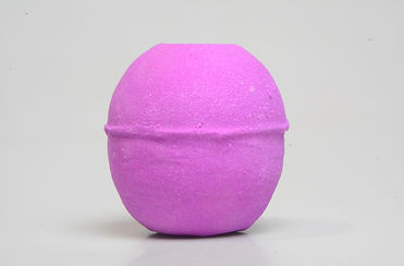


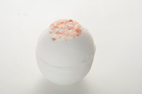


These images shown above are my best outcome images from this shoot without editing. I like these images the most because of how they are in focus, they have a plain background which looks professional, the colours on the bath bomb are vibrant and attractive. When editing, I will brighten the background up a lot more, bring out the colours in the bath bombs more and either delete the background with the quick selection tool or even it out so they're are no odd shadows. I would also go over the background with a spot healing brush incase they're are any lighting errors or spots. As a result, I do like these images very much although I think they will look even better after edited.
Shooting in a professional standard studio was definitely a struggle for me as I have done nothing like it before. I have a old Nikon camera at home that I use occasionally in my spare time but I have never used professional standard lights and backdrops and a newer camera before. This was very overwhelming at first but after mu tutor Lee Gavin showed me what the lights and backdrops and camera does, I was able to experiment on my own and do my own shoots once he showed me the basics. After my first shoot, I did a few edits and was eager to go back and do more shoots instantly.
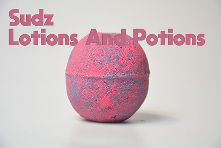
Initial Poster Edits


Contact Sheets From Shoot 2


Best Images Without Editing - Shoot 2


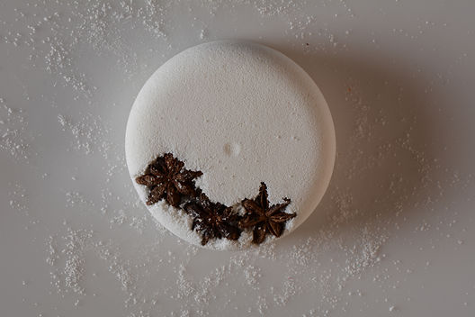


For this shoot, I photographed the floral fizzes for the website and social media I had recently created for the business. This would allow people to buy the products online and show people on social media that sudz is part of the industry.
The very first photographs I took on the right were awful. This was me experimenting with camera settings. The images turned out super dark to start with so I let more light into the camera by opening the aperture more. I then did this too much and it made the images too bright as you can see so I turned the aperture down a little. You could then see the product but it was blue and tinted blue. I changed the shutter speed so the camera took the picture quicker, I lowered the aperture a little again so you could see the bath bomb and then, I changed the ISO to 100. This then made the image a little yellow so I set the white balance to fluorescent, and white. This made the background white and showed the green of the bath bomb. I set up my lights and soft-boxes so one was in front and the one behind was brighter, I then started to get the images I wanted. There was still a little shadow so I kept playing around the ISO, the aperture and the brightness of the lights. Once I was confident about the images, I started to crumble pieces of the floral fizzes around the product so it gave the photo more depth and it shows the scent more. This is when I started to get some really nice images. I kept changing the angles and perspectives to try out new techniques but being eye level with the product, stuck the most.
The image shown with the arrow, I didn't like because the background came out way too dark and the lights were to harsh as you can see the highlights on the products too clearly. I then brightened the lights and the aperture and it did the trick.
The image with the circle, I really liked because the background was very white, the colours were saturated, the bath bomb was in focus and you could see the scattered bath bomb remains. I think the angle and perspective could have been better by getting up close and lower down but this was the first signs of improvement within the shoot.
I then decided for each product, to take a picture of the bottom facing directly up, the top, and the side angle with all of the remains scattered around the product. I want to put three image son the website of each of the product so the customer can see the top, bottom and a side angle slightly above the product. This shows all around the product. I may also add a video on every product to show it in use. I think once edited, the products will look very professional.
When it comes to editing, I want the products to look as natural as possible. I may enhance the saturation, the vibrance, use levels to make the background white, curves, the brightening tool that looks like a magnifying glass, a white brush on low opacity, maybe use the lasso tool to create my own background and cut out the product and finally, colour range which I have recently discovered.
I like the photos because you can see how much time and patience went into them. I am still learning as I have never photographed products or in a studio before. I have never really used the setting manual before so practice and experimentation is key, which is why I am going to do so many shoots.
During this shoot, I decided to photograph some of the soap flowers. I changed the lights slightly so that the one at the front was a lot brighter because I wanted the box of soap flowers to have highlights. The thin highlight going down the side of the box adds a really nice feature to the image as it looks like the product is sparkling. I think the blue soap flowers look the best as the images are brighter and the product is more vibrant. This was done by lowering the ISO, increasing the aperture, getting closer to the product instead of zooming in as zooming in loses quality and making the lights brighter.
I then photographed the soap flowers outside of the packaging so you can see a close up of the flowers that are made of soap. I got some close ups and different angles to show the flower as a whole.
I photographed some different soap flowers together to give some different colours in the photo.
For the white soap flowers, I decided to lower the lights and create shadow to tear the product away from the white background. I could have photographed this with a white background instead.
I think the white soap flowers photographed individually, looks really elegant and professional. I shall edit them to make them look a lot better but as they are, makes the image stunning.
I also really like the multiple coloured flowers photograph together to add some more colour into the image.
I also tried colour co-ordinating the flowers by photographing two white and two blue flowers together. These turned out very well although I prefer the white flowers on their own.
The blue and white flower images I think are my best images. There are just so many different angles and positions for the photos to be taken, it leaves you with multiple outcomes which is something that I really like. I would edit the background to be white instead of grey and I would bring the colour out in the products but I think I have strong base to edit later on.
Shoot 3 Contact Sheets


Best Images Without Editing - Shoot 3


For my third shoot, I photographed the rest of the soap flowers in their boxes and individually.
This allowed people to see the lovely packaging that the soap flowers come in and how many you get in a box, but also what the soap flowers actually look like out of the box too. I like the close up images the most as I can tell that they would be the most successful images if they was to be put onto the website.
The background are nice and white and the colours really pop.
These test images shown on the left here, I don't think are as good as the contact sheet shown above as the ISO and the aperture was all wrong. The aperture was allowing too much light into the camera and the ISO was too cool, making the images have a blue tint rather than white.
I really like the images shown within the contact sheets on the right because they show some really nice close up images of what the product is. You can see that it is made of soap and you can see the detail and colour. I really like the depth of field in some of the images and I also really like how the product fills the frame. I like the angles I have experimented which makes the shoot very successful. To improve, I would have liked to try and experiment with the settings further to get a more white background rather than grey or yellow.
These images shown here of the cold and flu packets, I personally do not like as much. Because the packets are see-through and flimsy at the top, they do not look great in images. I still had to photograph them as we sell them but, the soap flowers look a lot better in my opinion. I still like the close ups and the multiple angles I have used to take the photographs with but, if I were to do the shoot again, I would experiment with using a black background.
I then developed onto photographing sets. Multiple different colours and ranges of the soap flowers together, makes a really nice image because of the different co-ordinated colours that are put together. It gives the images edge and I really like this. I think I would try and make the background more white when editing though.
My best images from this shoot are much better than the final images from my previous shoots. The images are more clearly, I have decided to use a add-on macro lens to get up close with my shots and, I have experimented with putting multiple products together as a bundle to show mixtures of colours and scents. The images look pleasing and this shoot was very worth doing.
What are the biggest success factors from this shoot?
I believe that the biggest success factors from this shoot, was definitely photographing close ups of the soap flowers, and photographing a range of the soap flowers together as the colours went really nice together and it looked pleasing especially from the angle.
I showed some of my peers these photos as they was looking over my work and they even said that the grouped soap flower images were the best due to them filling the frame and looking pleasing.
How would I improve this shoot if given the chance again?
I would experiment with more soap flowers, more products and organise them in a bunch more ways than I already have. I would like to have plenty more outcomes and options to choose from.
This shoot has affected my development I think in a good way because I have been able to get better outcomes than the shoots previously. I have been able to use manual settings only and see had great outcomes like these images which look great as an end result.
The strengths from my final images I think or the angles, and my weaknesses I think are the lighting and settings due to the background looking too grey and dark although I can try and adjust this using Photoshop.
Contact Sheets shoot 4


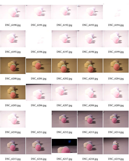
As you can see by the contact sheets with this shoot, the images started off a very cool temperature due to the temperature of the white balance which tinted the images blue, and the images was also too bright. To change this, I set the ISO to 100, the aperture wheel very high to let in not as much light and finally, a fast shutter speed. This corrected the colour and the focus of the images which made the outcomes look a lot better than what they started at.
Best Images Without Editing - Shoot 4


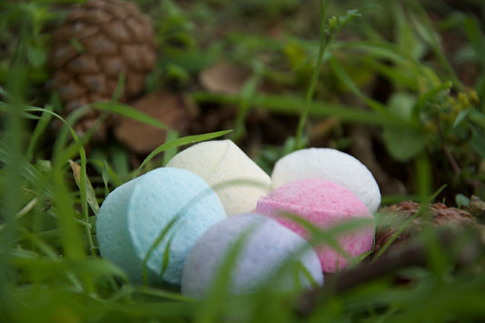
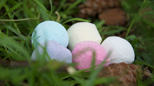


The images with the plain white background, are professional images that will eventually go onto the website that I have created for the business. They look far more professional and less distracting than the images with grass in the background. The images with the grass and dirt background are mainly for the social media pages. I chose to photograph the products in this environment because it looks natural. The grass, the dirt, the pine cone, all fits the image of looking natural and home made. I think people will be intrigued by these images because of the natural yet professional feel I have given the images. The images act as promotions for the website where you can buy the products.
The social media pages are almost like promotions in a way as they are allowed to be more creative to draw in the audience. The website is the place in which I want the products to look more professional without any distractions as the customer needs to see exactly what they are buying and what they are buying only.
I believe that these final images without editing, are successful because they are unique, they definitely do their job of portraying creativeness and they look like home-made, non-animal tested and natural ingredient products.
The weaknesses of the images are just that they are a little dull and not very vibrant although I believe that this could be adjusted within editing.
Shoot 5 Contact Sheets


Best Images Without Editing:

The image on the left is one of my best images because of the depth of field and layout of the products. These images all have white background to them as I wanted them to look professional. All of these images with white backgrounds are going on my official website that I have created for the business. When doing my research, I found that professional businesses and companies that have their ow commercial photography showing the products for sale, always has a plain white background. This is because they do not want the background to distract the customer from the product. This makes the image look professional and it makes the product look attractive. This is the look I was going for with these images as they will be used on my website. I have other images of the products on grass and in my hand for the social media pages as these do not have to look professional, just creative and stunning.
I like how the products are in the centre of the frame and the closest products are in focus with the couple of products behind that are slightly blurred. I like how I have experimented with many different settings and exposures to get to this final image, and I like how I have experimented with different layout and forms of all the products collated together.


Again with these images, I like how I have experimented with the layout and forms of how the products are leaning against and supporting each other. I think that gives the finished look of the photo, and, I like how I always have multiple of the variations of each product in the photo instead of just one. It fills the frame more and looks more attractive.
This image on the left shows a gap where the backdrop ends and where my wall is outside. I was aware of this when taking the photograph but, I decided I liked this angle too much to change it. Therefore I decide to take the photograph even tho the backdrop shows a gap and you can see the wall, because I could use Photoshop to prepare this. I could try and use the clone stamp tool, a soft brush with the colour picker to get the right colour, the brightening tool to cover this area or even mask the products out and create my own solid background.
So, some photos that have a gap in the backdrop, I was aware of this when taking the photo but I like the angle so I would rather experiment more with editing to repair this rather than not take the picture.


This is one of my favourite images because of how each product is leant to support each other. It looks interesting and creative. When it comes to editing most of these photos, I would like the make the background a lot more white, use the curve tool to enhance the products, saturate and make the colour of the products more vibrant to stand out. I still want the images to look natural and professional and not too edited as the editing and creativeness will come out on the social media pages.


I think these images with the orange products, are going to be the most vibrant once edited as their natural colour is already so bright. It will only look better and brighter once edited.


With the image shown on the right, I wanted to try something slightly different. I had the idea of photographing each product variation with the product in the foreground in focus but with the same product in the background blurry to give the image depth of field. So you can see the product but with multiple more in the background. I tested this with a few of the products however, I preferred them being jumbled up in multiple small groups instead.


I then decided to try out a black background. Some of the products are very light and even after edited, they did not show up too much with a white background. Therefore, I tried the lighter products with a black background. At first, I was not sure about using a black background because I wanted the images to look very professional and the website to look colour co-ordinated. Because I knew I had some really nice images with the white background, I was not sure whether it would match using a black background some images and a white background for others. However, I experimented with it anyway and I loved the outcome. I think the products show up so much more, I think that the image does look professional and I like how I sprinkled crumbs of the bath bombs on the material to create a earthy feel to the image. It looks better than having no texture.


These images shown here are other images that I loved while I was experimenting with several other layouts of the products and angles.


I think the pink products would look really nice with neutral white background. Once this photo is edited, I think it would look really nice.


I like the white products with the black background much better than the white background as they stand out more. I am just not sure if having some products with a black background and some products with a white background would fit together on the website as most websites just have white coloured backgrounds.
The image shown on the right is also really nice. If I was to edit this, I would make the background much darker by using the colour range method on Photoshop, or cut out the products using the lasso tool and adding in my own background.


I like how vibrant the blue products stand out with the white background. I think these would look really nice as a poster and as final images because of how vibrant the products are.


These images with the grass background and my hand, are images for my social media pages. I didn't mind if they did not look too professional as my main aim was for them to be creative and attractive to catch my audience's attention rather than focussing on the product only.
So, I decided to experiment with me holding the products and grass as it would give a natural, homemade feel to the image. The products are all homemade using only natural ingredients therefore, I thought it would only fit if I show this with the background and props int he images.
I really like the image on the left as you can clearly see the product, it is using natural lighting, the grass background sets the image aside of the neutral colour of the products and my hand and finally, the image has depth of field. I find it very attractive and hopefully my customers do too.
This will be another nice image for either the social media pages, background headers or banners. This image is aimed to entice the audience in and promote the business. The grass makes the image look natural and refreshing, the natural lighting sets a lovely tone on the products and the products look very soothing to the eye. I like how I have photographed this image.

Edits for Shoot 5
Edited Version

I like how this edit looks natural. I do not like the amount of blue shadow underneath the products as this looks a little too edited but, I do like the shade of blue that the products are and the light grey background. I think it would of looked better if the background was either more white or black instead of being an off grey but I will do another edit and improve this.
Original Version

Comparing my edit to the original image, I prefer the edited version. I prefer the brightness enhanced, the contrast and saturation of the edited image. I think it looks a little too edited where you see the dark blue shadows. I think this could look more natural and I don't like the grey background too much as I would prefer it to be white or black. This is what I will change on my future edits.

To edit this image, I duplicated the original image multiple times to do different edits on different layers. Layer 0 is the original image and each of the other layers as labelled, is the effect that I have created. For example, I used the levels to enhance the image on one layer, I tried out hue saturation, curves and various other effects to enhance the image. I then turned each of the layers off and only turned on two or three at a time. I then changed the blend mode of the layers selected and merged them into one photo. I used the blend mode soft light as it gave the most natural feel to the image. I like how I have edited this image as I was able to experience new effects and editing techniques. I think the levels and curves definitely had the best outcome.

Edited Version

Original Version

Edited Version

Original Version

Edited Version

Shown on the left is my favourite edited image. I like this image the most because of the pure white background, the colour of the products which stands out from the background, the layout and how I have organised multiple of the same product and finally, the little bit of shadow and product remaining at the bottom. The saturation looks really nice, the contrast and so does the brightness. There is nothing I dislike about the photo. I think the photo portrays the product really well, the organisation could have been a little better but it still makes the product attractive.
To create this look, I discovered an entire new editing technique. I opened up the image in Photoshop, rasterised the layer, clicked on select and then colour range. I then clicked on the background which was dark grey, I held shift and dragged and clicked multiple places to select all of the background and clicked okay. This cleverly masked all of the background instead of using the lasso tool. I kept the shadows, the remaining on the background and the products. I then used the level and brightness setting to enhance the background selected, too very white. I then edited the colour and contrast on the products only.
I think this technique looks very professional and it is exactly how I wanted it to look.
Comparing the image to the original, it looks more professional and it sells the product extremely well for the website. I will use the images of the product on grass and in my hand, for the social media. I did not want background distractions when buying the product on the website.
To edit this image, I did the same. I used the colour range tool under the tab 'select' to then brighten up the background. I then went over the background with the brightening tool that looks like a magnifying glass, this brightens any areas you click on and I went over the background with this, finally, I saturated and used the curve tool to enhance the blue product. The only points I don't particularly like about this image, is the organisation of the products. I do not like how the product at the top is placed so I would change this to being on its side rather than facing up, and the blue shadow on the left hand side above the products. There is a blue shaded tint that keeps distracting my eye. I did not notice this at the time of editing but if I were to edit this again, I would enhance it by using the magnifying tool or the clone stamp tool to clone the white over it.
Comparing the edit to the original image, the edited version is much better as it is brighter, the colours are more vibrant, the remaining of the product are shown more and there is more detail.
The link shown above takes you to a page where it talks about what the colour range tool is and how it works. They talk about the tool in a much later software; CS6 so it is not quite the same in the latest version of Photoshop, however, the end results are very similar.
I do not particularly like this edit shown here as it is nothing special. The background is patchy still as it has light areas and dark areas, the shadows are a little to harsh as are the highlights and the colour is not as saturated as it could be.
It is not as good as my other edit with the orange products but this edit was before I discovered the colour range technique. I will be experimenting with this image again.
Contact Sheets Shoot 6


Best Images Without Editing:

The image shown on the left is of one of the bath eggs. Again I have photographed the image amongst leaves and on a huge weed because the environment looks natural and home-made but also because it fits the purpose of the product. The bath bomb is in the shape of an egg which reminded me of Easter and Easter egg hunts. Therefore, I thought if I slightly hide the images outside, they will look natural, but it will look like an Easter egg hunt. Like it is a game and the children have to find the hidden bath bomb eggs. I thought the photo-shoot was different, fun and would intrigue the children.
From this shoot, I had the idea of doing specials from different times of the year for example eggs and egg baskets, straw and egg boxes for Easter, valentine love heart gives for valentines day, Mother's day bags and soap roses for Mother's day and so on.


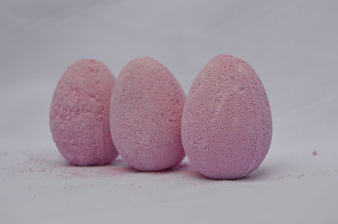
I personally find this shoot the most successful out of all of the previous ones. I experimented with various colours, mixing the colours together in the photo, depth of field, arrangements of the products, sprinkling remaining of the products on the surface and photographing the products with a different background.
They have come out looking just as professional as I hoped they would which makes this a very successful shoot due to me thinking my target audience will really like and be intrigued by the images.
If I were to do this shoot again, I don't think I will really change anything about it. I am that pleased with the outcome of the images, that there is nothing I really want to change. The only thing I think I would do is experiment with the settings and natural lighting a little more as the background of the images are little dull and need brightening up.
When it comes to editing, I would use the brightening tool that looks like a magnifying glass and I would brighten dark areas. I would then add more brightness, levels and maybe the curve tool to add in a little contrast to make the products stand out.
The strengths of the shoot would definitely be the organisation of the products, the depth of field and angles as they look very professional but unique and creative at the same time.
The weaknesses would be the lighting which I need potentially more lighting and practice with the settings to enhance this.

Contact Sheets Shoot 7

The idea of this shoot was to initially photograph a selection of the products we sell together. Professionally with a white or black background and creatively for social media purposes.
The best images with a selection of products are to show off the business a lot more. Not just each individual product at a time on the website and social media but to represent the business as a whole with a range of products. This may be set as the timeline photo on the Facebook page.
People will see the selection of images and immediately be intrigued due to us having multiple different ranges of products.
The success factors of this shoot is the concept of the images. Once edited, I think the images could look really nice. They would fit the nature of the website, social medias and children would love the images as some of them have a snail on.
I don't think this shoot was as successful as shoot 6 because the images did not turn out as great. Because the products are a range of shapes and sizes, it was hard to photograph them as a bundle due to them not being able to fit in frame properly, their being gapes between each product that I cannot fill, the colours not being o-ordinated and just random. This made the products hard to photograph because they would not fit together as I originally hoped they would.


If I were to do this shoot again, I would definitely try to colour co-ordinate the products a little more. I think doing this would look far more effective and eye catching rather than not looking at the colour and just placing random products together. Although a lot of thought did go into the photographs, it does not seem it due to their not being a colour scheme like white and purple or red and blue, it is just a mixture. Same with the organisation, I did think a lot about this when shooting but it does not show as it just looks all jumbled up.
I do not feel that this is one of my best shoots although, some images have come out really nicely.
Do I think this shoot was successful?
I think the shoot was successful to some extent however, I was not overly happy with the majority of the image outcomes. I think I could have arranged the products better in terms of colour and size. Although, some of the images are still good enough for the Facebook timeline I think.
What are the strengths?
I believe the strengths are the angles in which I have chosen to shoot, which are directly from the side and directly above. I also like the professional looking backgrounds.
This shoot was a challenge for me as a lot of pre-planning and organising had to be involved before shooting.
Best Images Without Editing:
Why have I decided to photograph a snail on one of my soap products?


I have decided to photograph a snail that I found, on the soap bar for the social media pages only, because I wanted to symbolise non-animal testing. Non-animal testing is one of our biggest and proudest factors of the company because we feel so strongly about it. Even with the products that are home-made and bought, the products are using natural ingredients only, they are non-animal testing and they are child and adult friendly.
I think by photographing a snail on the bar of soap, shows just how safe and reliable our products in our business.
When editing the images, I will be sure to bring out the colours of the soap and increase the brightness as the images are very dark. I did not have time to change the ISO and aperture as the snail was already moving therefore I will try an fix this mistake within editing.


I really like the image shown to the left because of the angle in which the product is leaning, the angle in which I have taken the photo and the colours that have been brought out by the natural lighting shining mainly on one side.
Me handling the soap, gives a sense of home-made and trust also because the image looks soothing. I think maybe if the soap was facing the camera instead of this angle i tried out, it would have looked better.


