YEAR 2 PORTFOLIO
Research into the medium I am going to be communicating through for my own client research:
I am going to be communicating through the medium of music. My understanding of this medium is that music is an art. The sound is an art within itself as it needs to have a story, it needs to be engaging and it needs to be catchy. Music needs to then have cover art to intrigue the audience to even consider listening to the product. The music needs to have advertisements and a music video for the visuals to connect with the audio. Music is a very big industry so it needs to be professional. It is important to know your client and what they're style is as you want them to be unique. I would need to convey they're style through the product I will be creating for them, and I would need to be promoting this product. I will need to research into the client and the music industry a lot more when creating the product for them however, I do already have some basic information on how different genres of music look different. For example, rock music would need a very dramatic and harsh title compared to something a lot more elegant which shows vocal ability. This type of music would need a more professional and elegant looking title rather than sharp and bold.
Even though the music is all about the sound, the look of the album, single or video is also very important as it is what promotes the artist and music.


Skype Call
Draft Questions for our first client call:

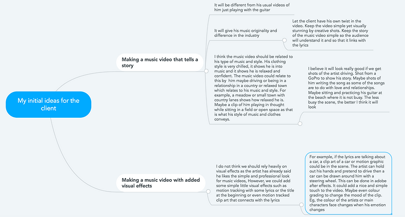
Shown below is my initial mind map I made as a little brief to get a few ideas down for our client. He may or may not like them and they may not work but they are just a few suggestions to where we could take his music video.
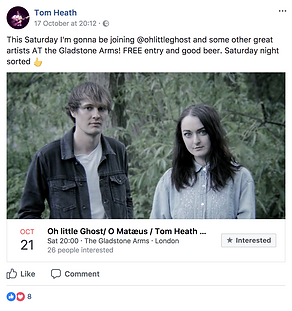
Tom Heath Social Media:
Facebook: https://www.facebook.com/tom.heath.1000
https://www.facebook.com/tomheathmusic Twitter: https://twitter.com/tomheath5
Sound cloud: https://soundcloud.com/tom-heath
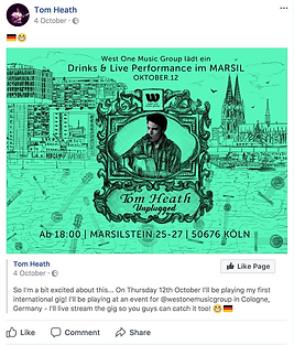
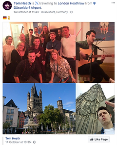
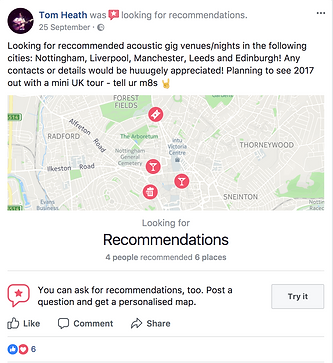
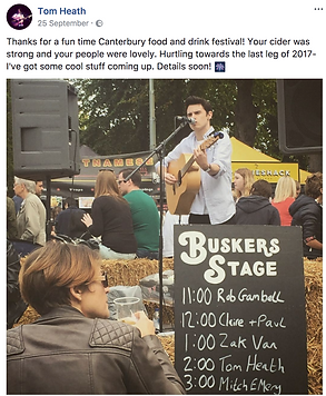
Shown above is a little mood board I have put together of Tom Heath's social media. It shows different events he has gone to, what his home studio looks like, places he has gone to do live gigs, where he has travelled to perform live and banners or advertisements he has had to advertise his music or live gig. I have taken all of this information from his Facebook page. It is not all of his gigs and things he has put on there but what I have found does give us a rough understanding of how big or small he is as an artist. It gives us a rough idea of who is target audience is for example, older teenagers/adults due to the music bing a little slow and who might go to his gigs to watch him live. His audience gives us a lot of information about his music and the video we are going to create as we now know who will be listening to his music. I believe that his target audience is older teenagers/ young adults and I believe that these people like slow, folk music instead of the hip hop hits of today.
I like the advertisements that he has created to promote himself as they attract your attention however, I do believe that if he was to make them a little more subtle with less text then it would make it look far more professional. For example, having his name in big with maybe a image of him or his face edited in Photoshop, the date, time and place of the gig and that is it. You want the promotion to be visually stunning not where the audience have to sit and read loads of writing because they wont look at it.
-
What is the medium of the product I am creating for my client?
The medium of a product is the message. The meaning behind the product and the message or hidden connotations it has.
The medium of the music video I am creating is to have a story. The whole point of creating the music video for my client is to create a visual story to tell the story of the lyrics of the song. To make the song visually stunning and attractive and to act as an advertisement for the single. The video will act as a play to demonstrate the meaning in the lyrics.
The medium platform my group will be putting the product on is YouTube. We are using YouTube because it is free to upload and it is a very popular platform. It can be accessed from anywhere at anytime and it allows the artist; Tom to widen his current audience by getting new songs and music videos out there to new people who may not of heard him before. It allows him to become recognised by everyone. The medium which is YouTube, allows us to communicate to Tom's audience by pairing the lyrics of the song to stunning visuals. It will captivate and entertain the audience for them to have a better understanding of the song and whats happening, to tell the story of the song and leave an impact on the audience. A lot of people listen to music but the music video visually connects and tells the audience what to think and feel. It makes the audience not just listen but pay attention and take in the message of what the song is trying to say.
-
My brief understanding of the client:
My client that me and my group are producing a product for is called Tom Heath. He is a striving music artist who loves acoustic pop and plays folk music. He is currently at university in London and is travelling from place to place for live performances and gigs of his own. He works with West One Music Group, he performs mainly in pubs and bars which helps him get recognised and he really wants to start having professional music videos for his music to get more recognised and to be able to have his music connected to a visual story. 3 of his favourite music artists are; Frank Turner, Regina Spektor and Francis Joy. Looking more in depth at these artists, they do have some similarities to Tom Heath and I can see why he likes their music. Firstly, Frank Turner has a similar clothing style to Tom which makes them look like they play the guitar and that they are very music orientated and relaxed. The denim jacket that is seen in many of Tom's photos when he does gigs is similar to what Frank wears in many of his pictures too. It gives them both a very chilled, music vibe which fits my initial ideas of some scenes perfectly.
So to sum it all up:
-
Tom wants a music video that tells a story for one of his songs
-
Tom plays acoustic/folk music
-
He loves the artists; Frank Turner, Regina Spektor and Francis Joy
-
He works with One Music Group
-
He tours and does gigs mainly in pubs and bars. Just started travelling further afield
-
He wears relaxing, chilled clothes and they associate with him being a music artist and they may also link to some of his aspiration artists
-
The clients needs:
The client needs a full professional music video to portray his song as a story. He likes the idea of storytelling therefore, he would like to have a story and plot to present the lyrics of his songs. Preferably not him in the music video or not often meaning we may need actors. Here is a short list of what the client needs for the music video:
-
Location. He originally had the idea to hire out the maze at Leeds Castle to get some shots for the music video but, unfortunately we do not have the time to follow this idea through so we are not looking at multiple other locations to suggest to our client.
-
Equipment. We are going to need to hire out equipment from the college to be able to have a professional video camera, microphone if needed, a tripod to get some still scenes and a gimbal for smooth motion. Most of this equipment either me or Adam in our group will have so we will not need to hire everything from the college which is better as other people might need the equipment.
-
Clothing. If he wants to wear any particular outfits or for his actors to have any outfits then he will need to supply this. Clothing may be essential for the character to play the part in the video.
-
Shooting and planning schedule. The will be essential so we will know we are either behind or on track to getting everything done.
-
Risk assessments and permissions to shoot on location or other people
-
Actors. He may want actors and other people to play parts in the music video. The more people, the more natural the scenes will look as backing actors and conversations will make the scenes look more realistic but it depends if he can get these actors or he may have to pay if he wants this.
-
We as a group will need to move quickly and effectively. The client will want the product to be done the best of our ability but we also have short deadlines so we will have to be quick and make sure the plans are realistic.
-
In-depth understanding of the audience of the product
My current understanding of the artists audience is that they are mainly young/middle-aged adults due to his type of music being acoustic/folk. Teenagers or younger do not typically listen to smooth folk music as the charts are always pop/rap songs. As of yet, we do not know much about his audience due to only speaking to our client once. We will speak to him much more and gather more information on his target audience but as of yet, we only assume who his audience is and what they are like from images from gigs and his social media.
As we can see from this image on the right, the audience he is playing to looks to be middle-aged
adults. The fact that he also plays at gigs, pubs, bars and cafe's suggested that he's audience isn't
young due to young people not being old enough to go to pubs and bars.
The platform that the product will be on is YouTube and maybe other social media of he's like Twitter
and Facebook to get people to acknowledge and view his video.
"Unsurprisingly, younger visitors tend to spend more time on the site. In March, YouTube drew 31.8
million users aged 18 to 24." - https://digiday.com/media/demographics-youtube-5-charts/
Even though it is particularly youngsters that use YouTube, we can see by this picture below that the age
range of people listened to different genres and styles of music. This allows us to have more of an
insight into who the audience may be for my client.
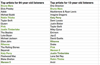
Does a 64 year old listen to different music compared to a 13 year old?
"One would expect that people of different ages would have different music tastes.
Let’s see if we can confirm this with our data. For starters, lets compare the average
listening habits of 64-year-old listeners to that of the aggregate listening habits
of the 13-year-old listener. For this experiment I selected 5,000 listeners in each age
category, and aggregated their normalised artist plays to find the most-frequently-played artists. As expected, you can see that 64-year-old listeners have different tastes than 13-year-old listeners." - https://musicmachinery.com/2014/02/13/age-specific-listening/
The image on the left shows just how much age can influence your taste in music.
Even though 64-year-old people may listen to some younger people, the majority
of artists that they listen to are older generations of artists. Such as, Elvis Presley,
The Rolling Stones or The Beatles. These artists are a much older generation
compared to artists likes Rihanna or One Direction whom are listened to by younger
people. The songs that these older artists sing, tend to be much slower and less rhythm
or beat. This suggests a lot about who might be the audience for Tom Heath. He
listens to and sings acoustic/folk music only. This means that the majority of his
audience is going to be much older. This now proves my point of his audience being
middle-aged or older. His audience must also be some what calm to listen to such
chilled music rather than listening to something more up beat with rhythm and drops.
-
My primary and secondary research techniques and how I can interpret my research into outcomes and validity.
For my primary research, we Skype'd our client and talked to him directly. We have only Skype'd him once so far and will need to Skype him, meet up with him and do some location scouts for filming but our first Skype call taught us a lot about him, what he is trying to do and get from us. We learnt about his style in clothing and music, the artists he likes, the original plan he had for the project and when we will be starting. All of this primary research, was very beneficial to us as it allowed us to research further into him and his music for the project.
For my secondary research, I looked into Tom Heath's social media to watch some of his YouTube videos and listen to his music, I looked at his Facebook and Twitter accounts to see what events he goes to, what events and gigs he has done and who his audience is in the photos. I also researched his three favourite music artists he had given to us over our first Skype call. I then branched my research out and looked into the main age groups which use YouTube and how different age groups and generations listen to different styles and music artists. My secondary research taught me who Tom Heath is, how he fits into the folk music genre and how he differs from other artists in the music industry. My secondary research has taught me a lot and has prepared me to make my own initials ideas for plans if our client likes it and wants to follow through with my suggestions.
How will I interpret my primary and secondary research for our final outcome of our product? Well, my primary and secondary research I have gathered so far will be valid for when we start filming as it has given me and my group, an insight into who Tom really is and his style of work. We do not want to give him a end product that is useless and has no meaning or really doesn't suite his unique style of music.
The information about Tom's clothing that I have seen from Skype and his social media, I will be taking that on board when we are on our shooting production days as his style and look will play a big part if he is going to be included in the music video.
The next part of research that I will be taking on board when filming and creating the product is how his favourite artists creates their music videos. If Tom typically likes the music videos of these chosen artists then it is important to analyse these videos for when we make our music video for him so that we know he is going to like it due to having elements and techniques of videos from artists he likes. Except we are going to include his own style of work to make it original to him.
Midterm Evaluation - Client
I believe that my group members; Adam Haynes, myself and Simon Harrison have equally been producing work for our client project. At the current moment, there is not much work we can produce with such little information. We have emailed him several times to get a basic understanding of what he wants us to produce and to arrange a time to Skype call as he is currently in London at university, but, with the information we have got from him, we have been able to gather some research and understand of him as an artist and the music he produces. Soon we will be filming and editing the product to get it to him as soon as possible to the best of our capability. He originally wanted to hire out the maze at Leeds Castle, however, we are not able to do that in such little time limit that we have.
We could have maybe hurried a bit more and booked other Skype calls to come up with ideas and plans to be able to make shooting schedules but at the current moment, it is up to our client to know when we can have a meeting or not.
What we have been able to do is sit together as a group and discuss when we are all available, what questions we will be asking our client and any possible initial ideas we all may have for him.
Adam Haynes - I believe that Adam has contributed a lot to our group for our client as he wrote the emails and kept in contact with our client to discuss what days we are all available and are able to Skype. Adam also created his own Word document exploring Tom Heath's social media. Adam is also very good at filming and editing therefore he will be a big help there.
Simon Harrison - Simon helped take notes during our Skype call, he helped with the risk assessments and planning and he shared initial ideas into what we could for filming and editing the music video.
Callie Pocock - I helped mainly with the secondary research into Tom Heath, his music genre, how he fits into the industry and how he is original, the artists and music he likes and I analysed his videos and compared them to his favourite artists.
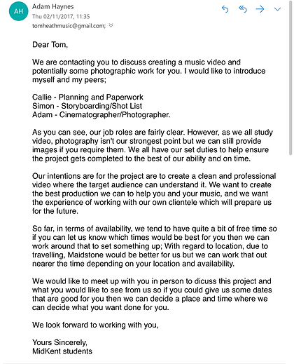
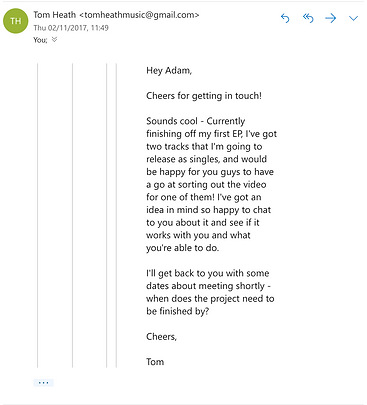
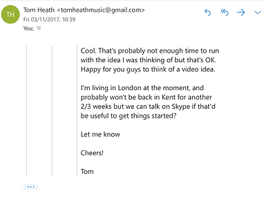
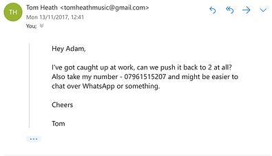
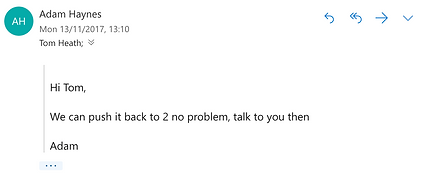
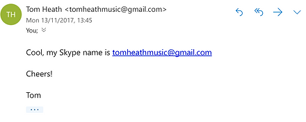
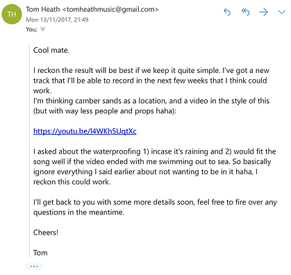
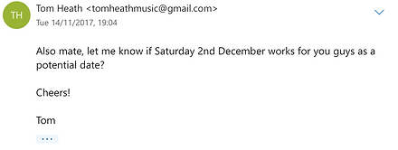
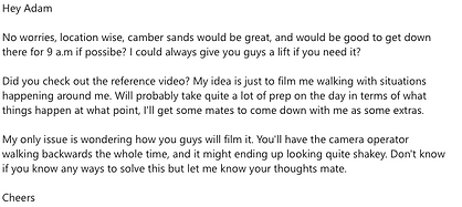
Shown below is all the emails in order of which we have been in contact with our client. Even though they are all sent on Adam's college account, the rest of the group did have some input into what we should say and respond with to the client. Especially the first email sent to our client, the whole group was involved when writing it up. Adam then took control and was sending and responding to the client which was really good.













Shown below is our original plan for our client. What we are doing, when we are doing it etc. I have also updated this in my own way too.

Where are we currently:
The planning and researching is done for our client. We are currently just building and developing ideas of how we are going to film the product then edit it. As a group, we are discussing what camera angles and movements we should use when filming on our first production day. The evidence of planning and researching is shown above as well as on my team's websites.
What do we need to do:
-
Create production schedules
-
Filming schedule
-
Lists of things to do and tick off what we have done
-
note what time we need to be at Camber Sands on our filming date, where exactly we are meeting, what time we are finishing and how we are getting there and back
-
produce storyboards, risk assessments
-
Individual and group evaluations
-
film and edit the product
-
hand outs so we can get feedback for the product we created and see what our client thought
-
feed forward for our next client projects
When are we going to do it:
Create production schedules - a few days before our first filming date. We are waiting for answers from our client as we need to know when he is free to be able to create a schedule
Filming schedule - we are going to create this on Monday 27th November. This will tell us our filming dates, what we will be doing, times for the date including breaks if needed and arrival times.
Lists - showing what we have done, when we done it and what needs to be done. This will be created Monday 27th and finished on Wednesday 29th.
Production storyboards and risk assessments - storyboard will be done on Monday 27th and Wednesday 29th, risk assessment will be done on December 1st before the filming date.
Individual evaluations should have all ready be done a while ago. Group evaluations will be done when project has finished.
Filming the product will be done on the 2nd of December and should only need one production date. If not then we will arrange for another date too.
Hand outs: We will producing and handing out little questionnaires to the public after showing them the product, to gain feedback to see what we can improve for next time. This will be done the day after, maybe two days after finishing the edited product.
What are our plans:
At the current moment, we are working on producing a schedule so that we know exactly where we are and where we are going next. This way we can work out exactly what we are doing on our filming date with the storyboards and risk assessments we will create. Once this schedule has been put into place, we will know more about the days and times of when we are doing things as a group. We are starting this production schedule on Monday 22nd November.
Who is doing what:
Adam Haynes - Adam is the main person in the group who will be taking control of the filming and editing of the production. We will all be contributing on this as a group as we are a team working for the client but Adam is best at knowing good camera angles and movements which we have all discussed about.
Simon Harrison - Simon will be producing the storyboards, risk assessments and most of the planning for the production as this will be needed before and after the production.
Callie Pocock - I have produced lots of research for our production. I will also be helping with the planning with Simon and have some contribution on the day of filming too.
How does the target audience of Tom Heath, effect the initial ideas we had?
Making a music video that tells a story - Making a music video with a story behind it showing the actions of the song tend to appeal more towards an older audience. For male, the target age range for folk music is 17-23 and for women, it is 13-25. So, the idea of having a romantic/ country story for the visuals of the music video, will match the target audience for the music genre as the music video is for a slightly older audience than something like pop. It is said that folk music is more popular with women than male due to the themes being love, heartbreak or nature. Most artists who come under the folk music genre, write and sing about their own experiences so the song touches close to home. I personally believe that the initial idea of the music video works best with Tom's style of music. Seeing as the themes of his songs are also about love and heartbreak, the matching video of him sitting and playing with a guitar or him walking and singing with things happening, works very well.
Making a music video with after effects - Making a music video with added after effects like the song 'Thats What I Like' by Bruno Mars as shown below, is a lot more childlike than just a plain and simple music video that tells a story.
I believe that the visual effects added to a music video usually makes it seem younger. This is not the case with all visual effects music videos but ones with obvious visual effects like drawings and shapes drawn, entertain younger people. Bruno Mars's target audience is far younger than Tom Heath's anyway so I do not believe that after effects added to his music video will not look professional or convey his style of music. Especially as folk music tends to have a serious and personal story behind, drawings and visual effects will not convey this genre.
This was the screen recording for our second Skype call on Monday 27th November. We discussed what videos were relevant to the one he wants to shoot like and where his inspiration comes from. We discussed locations for the shoot and other ideas and plans he has.
Shown below is a screen recording of the location we will be filming at for the music video. Tom decided for us to no film at Josh Bay due to camber sands being very windy and rainy. Hopefully this location will not be as windy and we will create great content with him walking along and miming the lyrics of the video for the song to be overlaid.
In depth analysis of Tom Heath's promotional material:
The advertisement shown above, is not directly advertising Tom Heath's music, however, it is advertising the time, date and place of where he will be performing. So people who may have never heard of Tom Heath before, will just see that their is performances and entertainment going on, they will show up and hear Tom Heath for their first time. It gives Tom a chance to widen his audience and for new people to take a listen to him. We can see by the advertisement that there is a guitar in the background and the fact that it is a colourful colour, means that it is going to be somewhat entertaining.
Strengths - the advertisement is colourful meaning the performance is going to be entertaining. The advertisement stands out by having a dark contrast of the fun purple against the rough looked white on the text. The logo get loud looks different and fun and its telling us just how loud and fun the performance will be because of how the logo looks a little funky. Its making the performance seem more appealing. The fact as well that the advertisement does not state a few people who will be performing there because they are leaving it to be a surprise, also makes us a little excited to listen and see new people.
Weaknesses - The only weaknesses that really stood out to me was the fact that it does not give us a specific place. It tells us that it is at the Caffè Nero but, it does not say which one or where this is. So, if someone saw this advertisement and wanted to see the entertainment, they wouldn't know where this cafe is or what one it is at in the area.
Opportunities - The opportunities that this advertisement gives my client is the opportunity to meet new people, advertise his music to a range of new people and age groups and hopefully get his name out there and known a little more by word of mouth from viewers at the cafe and people who stop by after hearing him.
Threats - The only threats that this advertisement might give is if the people sitting at the cafe listening to his music, don't actually like the music then it could have a negative word of mouth affect and people may not stay at the cafe. Meaning the cafe will also lose out on customers and will not want Tom to play there again.

Unit 9, 10 and Client schedule:


This advertisement on the left, specifically advertises Tom Heath's music album by having a picture of him so that people can like him already by his looks and so that they can recognise a name put to a face, having his name and the album name which sounds cool so people will be intrigued and specific dates, times and the place he is performing at.
Strengths - The strengths of this advertisement is that it is bright and colourful. Even if someone was too far away to see what the advertisement is, they would still find it eye catching and it would intrigue them to read it and it may stick in their head. The advertisement also has plenty of pacific information on so the audience will know exactly where to go with times and their should be no questions needed to ask.
Weaknesses - The weaknesses of this advertisement is that it looks a little busy. The background of the buildings are all highlighted in black as is the text and picture of Tom. This can be a little confusing when looking at the advertisement from a distance. However, I do like that Tom's head is in colour to separate him from the busy background.
Opportunities - The opportunities that this advertisement gives my client is the opportunity for fans to see his talent live, for new people to listen to his music and potentially become a fan and buy his music.
Threats - The threats of this advertisement is if people do not like it or feel attracted to it. This means that people will not want to see the artist or listen to his music because of the colour or the fact that the writing may be hard to read due to it being busy.
The advertisement on the left, is not necessarily an advertisement because it does not have text and colour or been edited as a leaflet or handout for the show but, it still is an advertisement in a way because of how it gives an insight into the show he does. It is advertising him as a live artist and it advertises the cafe due to seeing the entertainment in the picture. He also uploaded a live video on his Facebook channel to show the performance.
Strengths - The strengths of this advertisement is the picture and live video. This advertises Tom's live performances by seeing how much of a talented singer he is. It gets his name out on social media to so you can see where he performs and what he is like.
Weaknesses - The weaknesses of this advertisement is the look of it. It does not look typically appealing, fun or interesting. It looks pretty plain and boring, meaning not many people would want to click on the video due to it not really standing out. The thumbnail also says nothing about the artist or his music so the majority of people will probably skip past the video to get to something that stands out more.
Opportunities - The opportunities that the advertisement gives the client is the opportunity to have a wider and more open audience. People who may not have typically heard or seen Tom before may become a fan after seeing his live performance video.
Threats - The threats that this video may have is a negative impact on the audience intended. For example, if the target audience find the thumbnail boring, then they will not want to click on the video. If they find the video boring and dull and not good as his released songs, then the artist may lose some fans due to lacking talent performing live or not being very entertaining.
Tom's email saying why he has chosen this new location to shoot at:

Tom Heath - 'Better' analysis:
My client: Tom Heath, just released his new single 'better' and this is the song that he has chosen for us to make a music video to. Again, like Tom's other music, it comes under the genre of folk music due to the acoustic, slow theme of the song.
"As I see a new life that we could have built together" - 00:44 This quote from the song tells us a lot about the potential private life of the artist and what he's going through or been through. It also tells us so much more about the nature of the song. We learn that the song is about romance or a pas relationship. "This year for Halloween, I'm going to go as a ghost" -00:58 This quote tells us that the relationship he had has ended but he misses her so he is writing about it. This is what we as an audience gather from the story of the song. I believe the song is incredibly catchy and emotional, which makes the audience want to listen to the lyrics all the more. I also believe that the song will connect very well with the visuals that Tom wants. For example, Tom had said that he wants the video somewhat similar to the music video '27' by Passengers. Where the artist is walking along and people come up behind him and he mimes the lyrics. I think this shows the emotion and connections to the lyrics which works.
The music video shown above, '27' by Passenger, is the music video suggested by our client: Tom Heath, to watch as this is what the basis of his music video will be. He said that he loves how the artist walks around singing the song while other backing actors come up and give stuff to him and walk out and back in shot. He likes how casual and different the music video is and he thought that it would definitely fit the nature of his new song. Watching this video, I can see how he wants a group of people to come up to him then go away and go from scene to scene in one shot. I think it would look very good especially the transitions from scene to scene without any cuts. I think this may be a challenge but I think it could work and I think it would look very effective.
The video shown above was used in my screen recording when editing as it allowed me to learn exactly how I stabilise my footage in Premiere Pro CC.
This video here is the final virtual location scout hat I have created for our group. It allows us to see the exact location in plenty of videos around the beach and a walkthrough from a 3D satellite. I can see exactly where we will be when doing the shoot and it will allow me and my group to discuss what will work best and how for the space that we have.
In the group discussion that we had after creating the virtual location scout, we all thought that the location was ideal for the nature of the music video. I had the idea of making a flat pathway in the sand with markers of sticks to direct Adam whom will be the camera man. That way he knows he wont trip or fall over anything, and he will know where he needs to go when walking backwards filming Tom walking towards him. Another idea that we had as a group, after Tom gave us his rough plan of what he wants at what times in the song, we thought it would be a good idea for us to walk through the song a couple times and set out each of the scenes already for when Tom is walking by. What we mean by this is when Tom is walking and the extras are coming up to him, he walk walk from the car scene to the waitressing scene etc. in one shot. Because Tom is walking towards the camera, it will look as if he is walking through time from scene to scene. We was easily able to connect this idea with this location meaning it would be the ideal location to set the scenes in.
Obviously we have to look out for the forecast because if it starts raining or snowing then we wont be able to film on that day but so far on the forecast, it is looking positive for our filming date that we have on the 2nd December. It will just be a little cold.
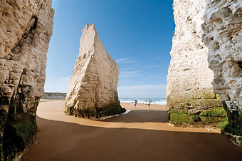
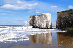
We also thought about how we could take the album cover photos by the cliffs or islands which would be a nice view. Maybe even with Tom looking in the distance as his song is about time passing. We agreed with our client on the location as we had created the virtual location scout.
The video shown above is the first test that we put together. It was a very quick test to make the sequence and see what it looks like. We then made a survey and got opinions in it to see what we could change about it to make it better. With these changes, we made our first final video to show the client.
Once our group made this first test video, we had a quick discussion about what we thought was the good points and bad points about it
The video shown above is the final video that we made to show our client. We also showed many people who filled out the surveys from the first test video and we got feedback from them. This allowed us to make a even better final video.
This is the long screen recording I created for when I tried to stabilise the footage. The first thing I did was to put the final video into After Effects and add stabilisation to it. I tried to smooth out the shakiness of the camera especially towards the end but unfortunately, I found that it made the footage even more shaky and uneven. It kept zooming into the footage and adding extra movement to it therefore, I stopped adding stabilisation and I came to the conclusion of just trying to colour grade the footage instead.
This is the edit that has been colour graded. I personally believe that it looks much better than the final product we had as it was way too exposed and unsaturated. I should this to the other members of my team and they said that they had liked it. It adds more colour and darkened tones which I believe was really needed.
TOM HEATH - BETTER
Shown above is the very last edit of the new music video for our client. We sent over our final edit that we had done with the colour graded tones and the client has added in his own titles with the font that he has himself and has uploaded it on his channel. This is the official final cut for the product we have made for him.
Shown below are the advertising promotions that our client has put out for his new music video. He is put his promotions across Facebook and Instagram to entice the public to watch it. Me and Adam both edited the photos we have taken by enhancing them naturally with a few added filters and the client has added his very own text to them before putting them online. I believe these promotions are very well done as they look professional and unique to him which is key in the industry.
I believe that the promotional materials look far better than the ones he has created previously for his music as he has made them all the same font with only the key information which is the song title and date it is released. We can see how eager and excited he is for it to be released due to his captions he put on Facebook saying he is excited.
Secondly, I like how he has saturated them and sharpened the stills from the music video to make the promotions stunning and entertaining. It will make the audience excited and want to watch the music video because of the crazy ghost costumes and things going on in the promotion images. As he said on Facebook, this is his first ever release and music video for his channel so, it will be something very different for both him and his audience and, it was a great experience for me and my group to take part in.
I think the bold text and the simple image of the cliffs and sea on the far right image looks very professional and simple. I think that is my favourite because of the simplicity of it. Although the other image is fun, I think the image on the bottom right has some sort of class and professionalism about it.
Supreme - Fashion client
To start off our fashion advertisement for our client, I made a few mind maps of the different brands we own amongst our group. This allowed us to see what we are able to shoot and create with what we have and clothing we like as a group.

The first mind map shown above, was something that was created quickly to just note down different brands that would be good for the photoshoot and video trailer. They are all brands that at least one member of our group own. The brands that are highlighted in yellow which are; Supreme, Adidas and Nike, are the most likely brands for our group to use. They are the brands that we believe to work the best.

Shown above is a mind map of the three clothing brands that we as a group, find the best. I have made a list of both the good points and the bad points of each of the brands so that we are able to discuss which of these brands we are able to create the best product for. It turned out that once I had shown the other members of the group what I had done, we all came to a decision that the brand Supreme, would be the best client for us. It is different, recognisable and it fits the model in our group meaning the photos will turn out good.


Shown above are some good points about having Supreme as our client. For example, it is original as not many people own the brand Supreme, they have lots of collaborations such as Vans and I believe that my group and I would have a lot of fun playing about with it.


"Supreme is a skateboarding shop and clothing brand established in New York City in April 1994. The brand caters to the skateboarding, hip hop and rock cultures, as well as to the youth culture in general. The brand produces clothes and accessories, and also manufactures skateboards. Its shoes, clothing, and accessories are sold extensively in the secondary market.
The distinctive red box logo with "Supreme" in white Futura Heavy Oblique is largely based on Barbara Kruger's propaganda art." -https://en.wikipedia.org/wiki/Supreme_(brand)
The clothing brand Supreme, sells everything from caps, coats, hoodies to t-shirts, bags and accessories. Supreme has become largely popular since 1994 when it was established. It only grew in popularity since. People cue outside the Supreme stores in London and New York. It is said that 'Supreme refuses to sell out' although it sometimes does very quickly when there is a new release.
Supreme has many collaborations such as"Nike, Air Jordan, Vans, Clarks , The North Face, Hanes, Playboy, Levi's, Timberland, Comme des Garçons, Stone Island, White Castle, and Hysteric Glamour." - https://en.wikipedia.org/wiki/Supreme_(brand) It allows for both brands in the collaboration, to gain more fans and income from both parties.


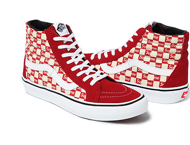


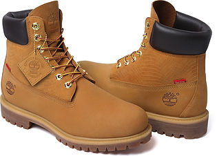

"Collaborations have been a longstanding staple within the streetwear industry. A decent, well thought-out collaboration will fuse the strongest elements of all parties concerned, resulting in a project that’s both a meeting of minds and a mutual respect for one another." -https://www.highsnobiety.com/2017/06/15/supreme-clothing-brand-collaboration-list/
"Over the past 23 years the undisputed kings of the collaboration, Supreme, have chosen to work with a huge variety of partners that include skate brands, footwear brands, artists, musicians, tech brands, photographers, film makers, sporting goods manufactures, toy companies, furniture makers and even a motorcycle brand. Many of these collaborations have come as a huge surprise to Supreme’s newer customer base, but each one was has a genuine link to the tight-knit crew behind the New York label." -https://www.highsnobiety.com/2017/06/15/supreme-clothing-brand-collaboration-list/
After researching about Supreme, I then had a look at some of the models that wear the brand.
Chris Brown

Chris Brown wearing the Apache tee and Supreme beanie. Chris Brown is a famous singer whom has one many awards within the pop genre of music. I think seeing him in the Supreme clothing, promotes the brand due to his young audience wanting to follow the fashion trends and famous role models that they look up to. Because he is in the pop genre style of music, most of his audience will be around the age of 15-35. Because it is such a young audience, they will think whatever he wears, is cool because he is famous and if they wear the designer brand, they will equally be is cool.


Drake Graham


Drake owns a lot of Supreme clothing. From tees to beanies to even hoodies. It is no surprise that he is a big fan of the brand. Drake is more of a rap artist. His audience is very different from the artist Chris Brown as his audience is aimed towards an older generation of people. We can also notice his audience is mainly black which also indicates the rap is explicit and potentially racist due to that genre of music being 'cool'. The fact that Drake wears Supreme, influences the older generation audience to wearing the brand due to it being the cool thing to do.
Frank Ocean and Jim Jones
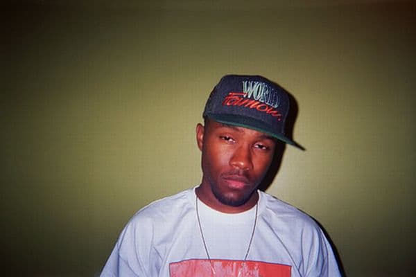

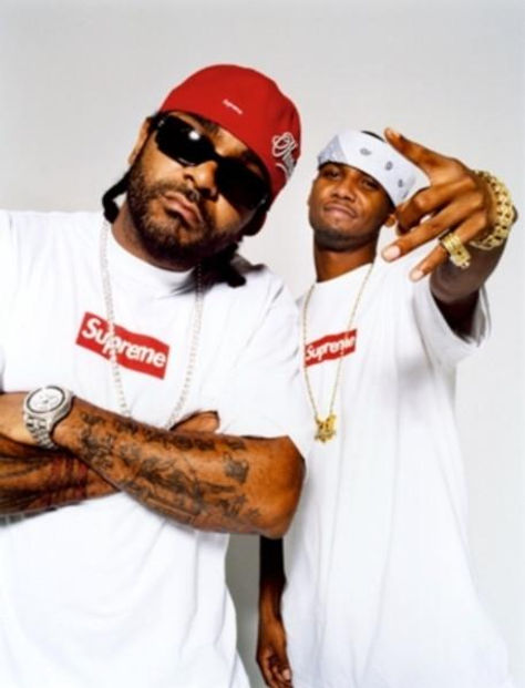

Jim Jones and Frank Ocean are two other celebrities that wears a lot of this brand. In a way, these celebrities are icons for the brand as they make the fans want to look and be the icon of the artist.
Jim Jones and Frank Ocean are both rap artists but for a slightly younger generation audience than Drake. Some of there songs are explicit but the majority of them are just plain rap which appeals to younger potentially black and white people. The fact that they are also on the face of Supreme, indicates that they may work in partnership with the brand which will hugely influence a younger audience due to being fans of these artists and fans of Supreme.
Analysing Supreme photography on their website:


As you can see from these images shown above, the Supreme website tends to use only images of the clothing without any models. It allows for the audience to really see the product that they are buying from all angles. The only thing they cannot see is the fit and how it looks on someone as their are no model pictures.
Saying this, I believe that it would be a good idea to maybe shoot some of the Supreme clothing products that our model has but on the model. To give maybe the website more to look at. Because of how expensive the clothing brand is, you want to be able to see the fit and the look on the model.
Shown below are some models that I have found wearing Supreme.
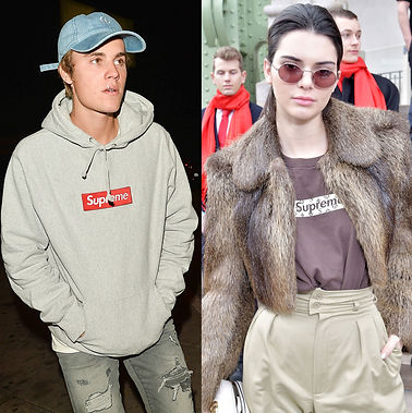


Something that I learnt from looking at different Supreme models on the internet, is how they are mostly mid shots or close ups. It allows for you to see the texture, the fit and the look of the clothing on someone. It also allows for the audience to imagine the clothing on them. I think that looking into these images, will help me on my photo shoot due to knowing what I want to create for my client.
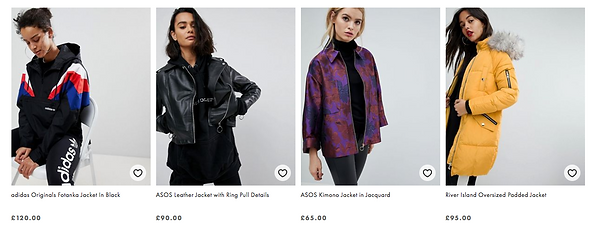

The two strips of images shown above, are from the clothing brand ASOS. I decided to use these images as part of my research into the models and how they are showing the clothing. For example, the different poses and stances that they are in, the composition of the photos, the frame, the shot e.g. a mid shot, close up, the angle of the shot and the lighting or back drop of the photograph. This will all help when it comes to me taking photos of the model for our client. I can clearly see by the ASOS model photos, that they use a lot of long shot frame photographs to see the whole outfit so people may see what goes with that item of clothing. I also notice that the model always has a white backdrop so that they stand out away from anything else that may be distracting. Even white clothing will stand out from the white backdrop being further away. The last thing that I have noticed, is that the camera is not always taking photos at a flat angle. Sometimes the photographer may use a canted or tilted angle technique to give edge to the image. The model is never in the centre of the frame either. The model is either one side or going from the centre to one side so the frame is taken up by the model. It looks far more interesting.

In this photo shown on the left, we can clearly see that the model has a serious face making him look cool. We also see that the model is in the centre and slight left side of the frame.He is completely in focus and he is facing the camera making it look like he is looking at the audience. We get to see most of his outfit but all of the item that you are buying or looking at which is the jacket. We see that the model pulls the jacket look off really well which makes us want to buy it all the more.
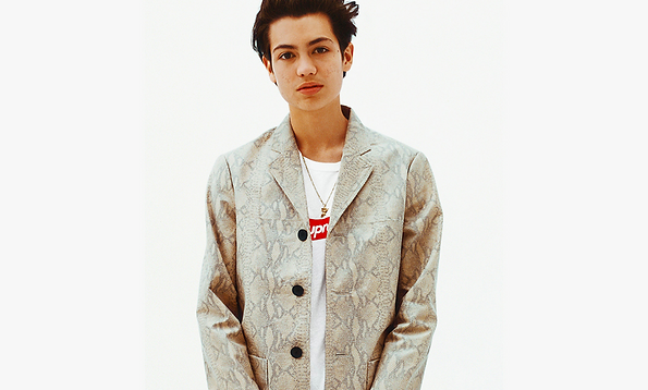

In this photo on the right, we can see that the model is in the centre and slight right of the frame, she is looking directly into the camera as most models do and we see that her posture and pose is pulling the Supreme shirt off very well. We can see that the item we are buying is the Supreme shirt, due to it standing out from the sleek black jacket and jeans she is wearing too. She is also showing us the shirt but opening up her jacket to show us.
In this photograph, we see that the model is in the centre and slight left of the frame as that is the way his head is leaning, he is in focus and looking directly into the camera, it is a creative and interesting looking shot.

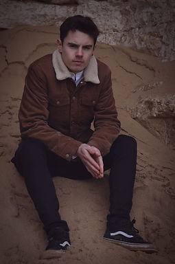

These images are the images I have edited for our client. My favourite edit is the one on the far right because I think it looks the most natural and subtle out of them all. They almost give me an old fashioned retro vibe which I think suits the client's clothing and style. The only probably we would have with these photographs is where the text would go. Im not sure where he would like the text to go unless he wants it just beside I'm or overlaid on him or even, motion tracked to the sand or background. That could have a really nice effects.
To create this look, I simply added a vignette by having a oval shape and making it black then feathering it out, then using a brush tool with the colour of my choice and brushing over the image with a low opacity. This technique is good for adding shades and exposures in certain places.
These two images above are not professional model images, they are just taken by the paparazzi but, it shows Justin Bieber and other famous artists wearing the same brand. This means that because Justin Bieber is so big and has a wide range of people in his audience, he will be reaching out to his fans to buy this clothing due to it being a designer brand in the face of Justin. Justin is seen as an icon already because of how big he is in the music charts, with him wearing this clothing and looking good in it, it will increase the fans of the brand also. As seen by the image below, Justin Bieber fans go to extreme measure to be like him. With him wearing the brand Supreme, the brand will definitely have a big influx of new customers because of him.

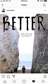
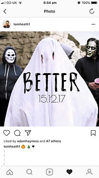

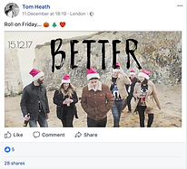
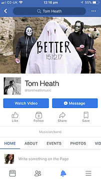


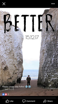
Shown on the right, is the little music video trailer that Tom has created and put on Facebook himself. It just gives the audience a little taster of the music video with the title and the date of release. I really like the font he has created himself and how he has put it all together. As we can see already, the video and Facebook and Instagram promotions have got many thumbs up meaning it is really beginning to draw attention to him as a music artist in the industry.
Shown below is our initial research for the brand Supreme. It gave us a in depth understanding of the brand and what they do.
Note: This whole document was created by Adam Haynes.

This contact sheet contains all of the images taken:

This contact sheet is test shots only:
The images with the arrows pointing towards them are the best images out of the contact sheet. I have picked them to be the best images because of the poses, facial expressions and angle of the photograph. With this contact sheet, I did not do too many different angles and movements with the camera as I like the eye to eye level face view of the model. I think these images from this contact sheet is definitely my favourite images out of them all.
What I would change or do differently next time:
-
Make sure there is not two shadows on the background. I would put two light behind the model shining on the background to stop shadowing and two light in front of the model further away to give a more subtle light and not make the face orange. I may also experiment further with shadows and angles.
-
I would experiment with coloured filters over the lights to give different effects to the images
-
I would do plenty more shoots in the studio and on location. Maybe beside the road or on a skateboard as this is what the brand is about.
-
I would really like to experiment with coloured smoke. I saw you can buy coloured smoke from big art shops near me and I think if the model had coloured smoke going around him while he is in a pose. It would look really really good. This would of also been amazing for a video. Maybe sparklers outside or torches in the studio with the lights off so you see the model from the movement light of the torch. Setting the camera on a high shutter speed to capture the trail of the torch. I think if we had a little more time and resources and Adam wanted to bring his clothes in more then these outcomes would have been more beneficial to the brand.
-
If we did the smoke and torch light effect in a video, we could have also made some lightning and glitch effects in their for a potential client trailer for a new item. So lightning flash and glitches would appear through the coloured smoke going around the model. We could have also gotten Adam who is the model, to wave around the smoke.
Finally, this contact sheet is the images from the final shoot:

To analyse the images from the final shoot, I believe that they went pretty well. After editing them, I can definitely see them being used for promotion. I feel they look professional and high standard. I like the angles that I have used and I like how they are all portrait to convey the theme of Supreme. I think when editing, I will look into doing red, blue and yellow backgrounds which are used for Supreme.
The images with the arrows pointing towards them are my favourite photographs out of the contact sheet. The image with the pink arrow is one of my favourite, because I like the pose that he is in, I like the facial expression and I like how you can see the top with the logo and the fit of it too.
The image with the green arrow is one one my favourite, because you can clearly see the whole shoe with the pattern on the side. We can see that Supreme has collaborated with Vans due to the style of the shoe and the white stripe which is unique to vans. I like how the closest shoe to the camera is slightly off the ground at the back and I like the angle it is taken in.
Finally, I like the image with the purple arrow because again I like the pose and facial expression of the model and I like how the hair is slightly messy to look casual yet the top is smart so it sets the smart casual look for the image.
Shown below are the edits I have done for our final advertising campaign photographs.
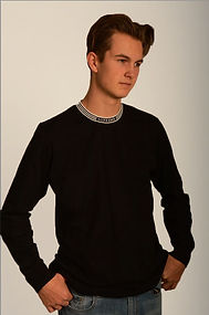


These are the final images I have picked out that I am going to edit even further with the Supreme logo and coloured backgrounds. Out of them all, I think I really love the bottom black and white photograph due to the contrast and dramatic effect that it gives.


This video shown below is what I watched to find out how I make a contact sheet in Photoshop. This allowed me to organise my test shots and final shots onto one page.
Evaluation of my groups advertising campaign:

The advertising campaign project is a project that the class got set and put into groups for. I was put with Adam Haynes and Simon Harrison for this project. Equally, we tried to share out the group's work to relieve stress towards the deadline. Adam was put in charge of modelling. Although we all would have liked to share those responsibilities, I feel that Adam could have maybe shown more effort to bring in the clothes a few times to do more than one shoot. I didn't like how he could not be bothered to go on multiple shoots for tests and final shoots to get really nice end products. This meant that we had nothing else to do apart from work with what we had which I did not like much. I was in charge of researching and paper work and Simon was supposed to be in charge of production paper work although he did not contribute much to the group. Finally, Adam also helped with research, initial ideas and final ideas of what we are going o do.
I personally, really loved doing this project as it was very different from other projects I have done on the course which meant it was able to challenge my ability a lot more and push my strengths into other areas. For example, I was able to shoot in a different style that I am used to as the modelled images had to be taken on a certain background with certain framing and angle requirements. We had to make sure the clothing of the brand was visible and that the lighting, background and model was in the right positions. What I liked best about the project was being able to go out on the test shoot and final shoot to get the modelled images we needed. Unfortunately, the group did not want to go on more shoots doing test shots and final shots so we could not add to the images or improve them due to not having the model but from the images that we done, I thought they were pretty good. They just could have been improved.
I think that the result of the images were effective as they show the fit and the look on someone. This will persuade the customer into buying the product online due to seeing the exact product they are buying. Some people do not buy online due to not seeing the fit properly. The target audience of Supreme who is 16-35 year old males. I think that the end product images, fit this target audience due to the model looking mature and suiting the outfits. It leaves a good impression on the audience due to them thinking they will also look as good. Once we had finished the final product, I made a questionnaire that allowed us to collect feedback information from what the public personally felt was effective about the product. The majority of the public that filled out the survey said that the images were effective because of how they capture the clothing in a positive light. You can see the clothing very clearly while also being able to see the size and fit of the item. This left a positive response with the public.
My biggest achievements with this project was being able to create professional looking images in the studio with branded clothing items for advertisement purposes. I have never done anything like this before and being able to experience advertising shoots and production paper work, has allowed me to explore more about the advertising industry. I can see just how much of an impact the advertising product I made, would have a bigger impact on the brands audience.
In terms of primary research, I have analysed and reflected upon images that we have taken to be able to improve and feed forward for the next shoot. The test shoots helped our group out a lot as we were able to create feedback forms for the public opinions to analyse. This then meant that we can improve on the next shoot we will do.
In terms of secondary research, I have done in depth research, facts and figures for the brand, analysed the images they have on their website, analysed stars who wear the brand, analysed other images of models from other brands to see how they look and have researched into other brands that Supreme has collaborated with. I think out of both the primary and secondary research, the secondary research has definitely been the most beneficial to our group.
I believe that during this experience, I have improved on my photography skills the most. This was because of how we experimented with the lighting and background. If I were to improve anything, I would have experimented further with the lighting. Maybe add colour and filters over the lights and I would have changed the positions of them. I also don't like how their are two shadows on the image. What I should have done was made the model stand slightly further away from the background, put two lights either side of him shining on the background so it is pure white and only one or two on the model so he is not as bright. I could have also experimented with the green screen to edit the background different colours. Or I could have experimented with Photoshop and layers where I put the white layered photo behind the model so the contrast and lighting is perfect.
To improve my paper work, I would have been more consistent with it and made sure I finished it. I could always improve and build on my paper work but the paper work that I had done I think helped our group a lot when on our shoot. If I had the chance again, I would of preferred if Adam had wanted to do plenty more test and final shots. This would mean we could of experimented further and had better outcomes but we couldn't as he did not have his clothes and did not want to do another shoot so I did not have a model. One other thing I would like to improve for next time is to be a lot more clear on what my final product actually is. My tutor Ross also agreed with me on his feedback, it was not very clear throughout my project or planning on what was actually the aim of doing the shoots and planning or what the final product would look like so this will definitely be improved for the next product. So the audience and client will have a clear understanding of what I have created.
To evaluate my groups advertising campaign, I believe that we had advertised the brand 'Supreme' very positively. The model images, I feel would really give the Supreme website more sells due to the customers being able to see the length, width, fit and look of the product before buying. Sometimes people do not want to risk buying an item for one simple image due to not seeing it worn, they do not want to risk buying the wrong item.
Specific analysis:

These two images shown are the best images picked out from the edits. I like how they are contrasted and saturated nicely. Originally, the background of the images was white but very shadowed and shaded. To make the background one plain colour, I used the selection tool and highlighted Adam. One I selected all of him and deselected parts I didn't want, I clicked on select and inverse and then the brush tool and coloured in the background the colour I wanted. It deleted all shadow and unwanted shade in the background.
The Supreme logo on the top is clear so people will recognise the brand and the contrast and saturation on the face of the model, makes the image look attracting meaning people would want to buy the item meaning, they will look just as good in the item.
I also like the black and white contrasted image due to it looking dramatic and original. It makes the top look really original and cool which makes younger people copy the model to look just as good.

Finally, I created a little questionnaire for the public to fill out. I printed off plenty of questionnaires to be filled out and I printed off plenty of large contact sheets showing my final images for the Supreme client. I asked what the public thought of these images and whether the client would be satisfied. Here is the response:


I am not quite sure why the feedback form person on the left was so confused because I had given everyone a contact sheet in front of them to show exactly what the questions were in relation to so maybe she was not paying attention.
The feedback form on the right tells me that maybe in our final shots, we could have been more creative due to the majority of them having the same angles. To improve, we could have used low cut angles looking up at the model to show power which the audience would find attractive. It will also allow you to still see the clothing. The person loved the plain background which is good as it means we do not have to change our final product. Overall, this was positive feedback as the professional look is what we wanted for our client Supreme.


As an extension to my fashion client evaluation, I believe that this product did connect with its intended audience due to the magazine advertisement being in the style of Supreme. The three products were in the colours of Supreme which is red, yellow and blue and the font title of the company was also on the magazine cover. The model was in black and white and was modelling the top of Supreme. I believe that the final product looked professional and creative with not too much writing as the modelled picture done the job. I believe that the product did connect with the audience due to it conveying the colours and font which is associated with the brand. The product is plain and simple and conveys the company well. I believe that the product was a success due to the audience being excited to read on about Supreme. I feel that the vibrant colours and branded title, makes the brand stand out from a distance away due to it not being over packed. It's a designer brand so plain and professional always works best. The target audience for Supreme and the magazine cover was discussed to be around 16-20 year olds due to being an expensive and semi-professional clothing brand. Therefore, due to this age group of people being the targeted audience for the product, I believe that they would appreciate the final product due to having primary professional colours that stand out just like the clothing brand does, meaning the product conveys the unique style of Supreme and it conveys the professionalism also by having a plain branded shirt of Supreme on the front which is in black and white for dramatic effect with the branded logo in the top right hand corner. The identified audience is seen to be younger adults so the grown up look of the product I think worked very well. The peers thought this also.
The feedback form on the bottom left agrees with the professionalism of the images which is positive but however, they said to improve, we could have potentially used coloured filters on the lights to give it a new look for the client.
The feedback form on the right suggests we could have done more close ups to show the clothing.
Overall, I think this is positive feedback and our group has gained some possible ideas for our next production.
This is the questionnaire that I made for the audience:
This is our video for our client Supreme. It is a motion graphic where the brand name slides in onto the red background of the logo. It is simple and easy. However, I do not particularly like it. The whole video was created by Adam although I did suggest a few times for me to film and him to model like we did on the photoshoot but Adam did not want to bring in his branded clothes again so we could not do a video or more photos. I think the video we have is pretty good but it is easy and it does not show much skill or originality. I think for next time, we should have done something more along the lines of having camera movements walking up to the model and circling the model in various angles with the branded clothes and different backgrounds. Maybe we could have experimented with plain white and black backgrounds, or a green screen or even outside on location. I think if we put more effort into doing it then we could have come out with a much better outcome.
Peer feedback for the advertising campaign project
Peer assessment for Adam:
I think that Adam also done very well on this project because of how much he contributed to the research. I was very impressed with how much he already knew about the brand we decided to make our client and how much he then found out about them. He came in very useful on this project and was a pleasure to work with. To improve, I would of liked to see him put more effort into doing the practical work. He did not bring in the outfits for any more days than the one time he had to. This meant we could not do any more test shots. Overall, I give Adam a 6/10.
Note: There were other members in our group like Liam and other people but they was only involved in the very first initial mind map of deciding which brand is going to be our client. After that, it was only me and Adam working on the project so we are only putting our names down for the work we have done. We are not sure whether they moved group or not.
Peer assessment from Adam:
I believe Callie done really well on this project as she done the planning, shooting and some of the research. The photos she took I thought turned out really well as I like the angles and close ups that she managed to capture but I think she could have maybe done a little more on the planning side of this project. Overall, I believe Callie worked very hard on this project so I would give her a 8.5/10.
Here are the Supreme posters I have created in Photoshop:

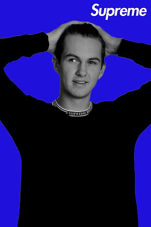


This is the screen recording for my own personal reference of how I created this look in Photoshop. It will allow me to look back on the recording and see what I did to create this and how I can change it in the future. The edit was simple and quick but I think if I took more time doing the contrast of the image before, I would have had a better outcome.

I have created different variations of posters for the company. The first three shown above are my favourite. I have used the colours red, blue and yellow because those three colours are on the face of Supreme. Those are the colours that are used to symbolise the company. I kept the model in black and white to give a dramatic effect to it. I feel like it looks far more better with the model in black and white than it does in colour so this is how I have kept it. I used the magic wand to select the word Supreme from the rd background of the logo and I tried placing it in different positions around the poster. Having the test 'Supreme' and the coloured backgrounds is what portrays the company so this is why I have followed this style.
I have then experimented with the same technique with the branded logo and coloured backgrounds but with another item. The shoes are a collaboration of Supreme and Vans. I decided to experimented with the shoes and this style to see how it looks. My favourite poster out of the shoes is the yellow background because it has mustard yellow in the shoes too and I just think the background goes really nicely with the image. I think next time, if I were to create these edits again, I probably would have adjusted the levels and contrast and exposure, maybe saturation of the shoe image before changing the background. I think this would have looked nicer.
Shown below is the risk assessments and evaluation of the client project:
Shown below are the risk assessment that Adam has filled out for our first location shoot and our final location shoot. This allows us to have permission to film on these premises which we have had already from our client gaining permission but the risk assessments highlight any potential hazards to our client and team so they can not blame us for any potential risks. The first risk assessment shown below is the latest one we used and the one below is for the previous location that we did not end up filming at.


This button takes you to Adam's client page where he states the exact camera, lenses and piece of equipment that we used for this production.

- Client Evaluation -
Firstly for this project, we all got put into groups. My group that I was put with was Adam Haynes, me and Simon Harrison. Each group then got given a client and our groups client was named; Tom Heath. Tom Heath is a artist who is just starting out in the industry. Usually he does performances and gigs in small pubs or cafes. He uploads his singles that he creates, onto his Spotify and Youtube. He writes his own songs from experiences he has had or is going through. and he records them in a small studio that he works in, in London. He wanted to step up his music in the industry by making a music video for his new single 'Better'. This is what our job as a group was to do. To come up with initial ideas, to film the music video and edit it for him, take pictures for his album cover and promotions and to give him the end product.
I thought that the outcome of the client's music video was very good. I thought that it was original to the artist, creative and I feel that the music video really connects with the song. The concept of the music video is really good as he does not have anything like this on his channel and I feel that it may just give him that extra step into the music industry. What I liked most about the music video was how the artist walks through each and every scene showing different emotions as if he is walking through time. I like how at different points, the artist comes closer and further away from the camera and how the handheld smooth movements drifts throughout the whole video. For a specific example of this, between 2 seconds and 4 seconds is when the camera does not move much at all but between the very end of the video when the artist is a waiter, there is a lot more movements with the camera, suggesting he has come out of his shell now time has moved on. Instead of being very still.
I think that the result of the music video was good as a whole however it could have been improved. I do not like how extremely shaky it can be at times. Throughout the video, it tends to be pretty smooth up until when the artist is a waiter. Some of the shakiness fits the clip, however, it can be a little too shaky ad unstable sometimes which may put the viewer off of the video a little. It makes me think about the camera and the wobbliness instead of whats happening in the video. What I also find very distracting is how Adam put the camera on auto focus. Because it was on auto focus and there was a lot of movement with the camera, the lens kept coming in and out of focus during the video. It distracts the audience from the artist and instead your eyes begin to wander into the background which is in focus. To fix this, we should have got a monitor onto the stabiliser and put the camera on manual focus. While Adam is moving the camera, I could have been looking at the monitor ad correcting the focus as we are filming. It will still be challenging as the client wanted a one potentially two shot video so the shots are long but with a monitor and maybe bigger stabiliser with the focus on the side, it would have been possible for the camera to be in manual focus. One other thing I dislike about the video is the extreme exposure which I actually fixed but Adam decided to not have my colour graded edit as the final. When showing the final video to peers, they noticed a slight error in the audio. I did not discover this at first but watching the video back, there is a slight audio error.
I do find the final product to be effective due to the majority of the public saying they enjoy it. The client has said himself that he loves the end product and that he is excited to be uploading it and showing his audience. I honestly believe that this product will leave an impact on his audience due to him being new and unique and exploring new areas such as music videos in the industry. It has allowed my group to gain skill and experience in working with a client but I think our client has also learned just how big the music video industry is and that to keep up with the industry, he will need to start producing videos to connect with his music. I think the product we have created for our client, will open his eyes to the industry more and allow him to see just how many more views he may get from connecting with his audience. It gives them something more to look at.
My biggest achievements within this project is definitely the experience. Being able to make time plans of when Adam is coming to pick me up and trying to work out how to get there, then shooting on location with a very lovely bunch of people was definitely my biggest achievement. I felt that I had learnt a lot from Adam in terms of equipment and how to professionally shoot but it was something that I had never ever attempted to do before. I really loved the location scouting and filming because it has always been what I enjoy the most but being able to share that and work for a client, was definitely an experience. I think the most challenging part was trying to figure out how to film it seeing as the client wanted everything done in one shot. Seeing as it is a beach and there are dogs and other people about, it made it hard to shoot in one long sequence so we had to suggest the idea of two shots with a swipe transition in between.
In terms of primary and secondary research, I believe that the secondary research was much more of a challenge than the primary research. This was because there was not much we could find on his social media platforms. He does not have a website so everything was dotted around in different places which was not completely easy to find. The only information I could get from his social media is advertisements and promotions he has put out for his gigs and things. I screenshotted and analysed these but there was not much else in terms of facts and figures. For primary research, we Skyped Tom a few times and asked him who his favourite musicians and music videos were. I then noted them down and I was able to research in terms of that.
I believe that I have improved most on my planning skills. I had to plan in my schedule, make a few separate plans and, locate a position for every member of the team of what they are going to do. This allowed us to be on time for everything. Even if some shots took longer than others, I was able to give us extra time incase it did run over. I think planning is one of the most important aspects of a production because it could make everything work very well or it could make everything fall apart if not done properly. I think I have definitely been able to say that I have improved on my planning ability.
To improve for my next production, I would like to of got more involved in the Skype calls by talking and having things to say, actually film a lot of clips and edit them myself instead of standing back and be there for the presentation. I think standing back on the day was one of the worst things because I really love filming but I did not want to mess any of the clips up by doing it wrong. I think if I shared more of my ideas and opinions and had a go at filming then I have the chance to improve on my ability. I think not being able to be there on the day of the presentation was also a shame because it meant that Adam had to take over and present our project by himself which must have been really difficult. I think that presenting is one of the hardest things to do for me because I don't like to think I will mess up in front of lots of people so I think that showing u and doing the presentation, would have helped get me in the practice of doing them.
To evaluate, I really like the final outcome that we have for the client's music video. We have sent the music video and album cover images over to the client and he said that he is really impressed with it. I would love to work with many more clients and shoot out on location so this was definitely a positive experience from me. Next time, I would love to get more involved when filming and editing.
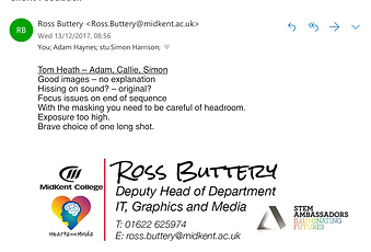

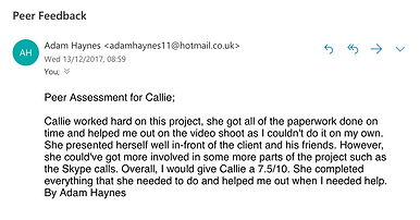
Shown above on the far left is feedback from my tutor; Ross Buttery on the presentation to our clients. Unfortunately I was not able to be at the presentation which meant that it was down to Adam to give a good presentation. This is definitely something I will learn from and be better at in the future. I have seen the presentation that Adam had created himself and I can see how it can be improved with Ross's feedback. This is a good learning curve for me as I can see what a presentation would need to look like. I also agree that the exposure is too high on our music video as I did attempt to colour grade it myself to correct that. The hissing sound that unfortunately we did not notice, the focus not being on manual which had caused a lot of problems and doing it all in one shot is what we could improve for next time. For example, if we were to improve it next time then we would purchase a monitor for the camera so that we can see the shot and potentially have a bigger stabiliser with the manual focus on the side so that Adam can film and walk normally then me being an assistant, can sort out the manual focus at every point rather than it keeping going in and out of focus with it being on auto.
My peer assessment from Adam shows that I have definitely contributed a lot towards the group. I have sorted all of the paper work and planning for everything we have done and the research provides us with visual information of what our production is going to look like. To improve, I would take a lot more part in the practical side like talking on the Skype call instead of just letting Adam do the talking and I will also email our client for information and potentially get involved in the filming, editing and post production stages.
For Adam's peer assessment from me, I feel that he could have given me and Simon more of a role to do. Maybe lean back from filming a little and let the other members of the group have a go and give ideas. Even if he decides not to use mine or Simon's clips, at least we had a go at filming and editing and take pictures for the album cover. I think maybe if he let others get involved a little more then we could have seen the focus problem and worked something out better at the time. But, I think what Adam did produce was very good and our group and the client is proud of the final product.
Simon Harrison was also a member of our group for the client work but he did not show much contribution to the work at all. He did not get involved in any ideas or talk in the Skype call or show up on the filming date therefore, I cannot really give him a peer feedback as again, it was mostly me and Adam working on this project.
Shown above is the peer assessment our group got from our client. He gave me an overall 6/10 which I believe I am very proud of. Me and Adam were both able to arrive half an hour early to the location as Adam drove, he was very prepared and had all of his equipment ready including the satnav so we knew how to get to the location and it was also Adam who communicated over email to our client to keep in contact and get information from. Adam also managed to film and edit on the day which was also a bonus. I think to improve on my behave, I needed to get more involved on the practical side of things such as filming and editing so my client can see I am putting more of an effort in on location. He did however like the photoshop edits I did and he may use them for promotion which is cool.
Specific analysis:
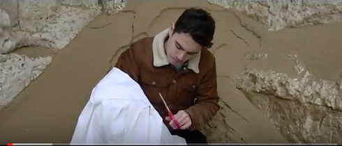


I have chosen this screenshot to analyse because I love the framing of it. It is the opening shot of the music video and it looks dramatic yet visually engaging. Tom does not start singing straight away because it is the instrumental introduction but even sitting there cutting eye holes in the cloth, The video instantly looks entertaining. Although, it could have had a little more exposure to it.
This screenshot is also very nice framing, it could have done with colour grading and a little less exposure but the framing of where the artist is, is really nice. He is walking towards the camera while singing and the background environment fits the lyrics. There are also leading lines of the cliffs which leads up to the artist which is what also makes the framing really nice.
Although the whole video was done in two takes, I like how the artist is walking towards the camera going from scene to scene without a cut. Although it is hard to film and takes a lot of patience due to exposure, manual focus going wrong and the camera becoming unstable, it looks so much nicer as a final product. Tis screenshot is at the point where the camera backs off from a mid shot to a long shot so that you can see the car crash surroundings that the artist is interrupting. I think the scene gives edge to the music video as each of these scenes we are walking through, makes sense in the song.
This screenshot is another example of the artist walking from scene to scene. This scene is celebrating christmas and New Years. We can see this by how the extras are wearing christmas jumpers, popping champagne bottles and blowing party poppers. It is as if time is flying by, the more the artist is walking along the beach. It is as if he is not just walking along the beach but walking through his whole life and it is shown in a story. I think it would of looked really good if we did some sort of motion graphic and colour grading so the scene changes colour when he is going from scene to scene. Like when he sings about summer with the girl he had to when it is christmas and he is all alone. I think if we made snow fall some how either in special effects or post production, it would of displayed the scene a lot better.
As an extension to my evaluation, I believe that the final product to my client project was a success due to the client really enjoying what we had made for him. He had posted it all over his social media for his viewers to see and watch. I think that this product was one of my better quality products that I have made due to the camera movement being smooth and colliding well with the audio. My favourite part about the music video was the very beginning when the artist was on the sand in the little cove part of the beach because it was a smooth opening shot and it fitted really well with the opening of the lyrics. The end part was also my favourite when the artist walked from scene to scene where he became a waiter for couples at the beach which was just before the camera backed off when he then ran in the sea. My least favourite part of the product was the middle when the artist was walking towards the car crash scene on the beach. This was my least favourite part because the camera became out of focus and wobbly. The shot did not look as good as the other shots in my opinion but, as a whole, I believe it was a really good final product for our client.
What opportunities did the final product give us as a group?
Seeing as the client was so happy with his product, he said that he would like to work with us again on some future songs and music videos which I thought was really nice of him and I would be delighted to. Another opportunity I have been given after my client project was further experience with Chris Newberry; the director of Wildwood Media. I have done a few work experiences with Chris before and I have loved it but after him seeing my final product, he has offered me some editing work experience for his new upcoming project because of how much he liked the work that me and my group had produced.
Did the product connect with the intended audience?
Me and my group believe that the product did connect with its intended audience due to the music video receiving lots of views and likes on Instagram. The fact that the target audience of mid-age adults such as Chris Newberry watch the video, means that the targeted audience are interested in the product.
Does the style that our group come up with, go with the style of Tom Heath's products and advertisements?
Firstly, the style of the music video that our group had created, was in a vintage style to match Tom's vintage style of music and interests. We wanted to keep it quite simple with a nice country vibe to it by having the shooting location at the beach where theres lots of space and open air, and we didn't want to have too much going on in each scene because we wanted to portray the country vibe as his lyrics have deep meaning. Tom's style of music is country/folk music and his music that he produces, is very much along those lines although his videos did not portray it. We wanted the music video to stand out from the videos he has already made because we wanted it to match his personality and his style. I believe that the music video does match Tom's music style because we kept the vintage country vibe in by having the perfect quiet location and the props in the scenes to match the lyrics and story of the song. The advertisements for the product also match the music video by having the same colour correction tint to them, the same title font which is used by the client himself, and the really nice shoot cover we shot separately to the video.
how does the product make his portfolio look? and does the product stand out in his portfolio and in the industry?
I personally believe that the product makes his portfolio look professional and creative. A music video is not something that he is typically used to due to not having done a music video before but, a think the video ties in very well as he is able to give some visuals to the lyrics he has wrote. Due to the music video looking so creative and different, I do believe it stands out in his portfolio due to him not having videos and yes I do feel that it will stand out in the industry. Although the music video was only shot but a group of college students who does not have much experience, I do believe that it looks professional, I believe that we will all become a lot better at cinematography in the future, however, what we have produced should make Tom stand out in the industry as we have had several comments by the target audience range, that it is a very good product.
The target audience for the client was discussed to be middle aged adults around the age of 20-30. This is because country/folk music is never seen to be too popular for younger aged people. With this said, the intended audience would be looking at a product that is clear in the genre and gives off a relaxed and chilled vibe. This is what the intended audience is looking for in the product which meant that the location, colour grading and transitions, was key in our product due to needing that relaxed, chilled connection with the target audience.
When I had got my feedback from my tutor and my peers, they believed that the product really suited the intended audience due to carrying the lazy, chilled conventions in a folk music genre. This works well as it means that this product will be a success in the future.


