Secondary research from a book
- Callie Pocock
- Mar 5, 2018
- 4 min read
Updated: Mar 24, 2018
'The complete guide to Digital Illustration' by Steve Caplin and Adam Banks

Page 20 of the book teaches me about image resolution which was extremely useful. The resolution of an image depends on he amount of pixels per square. Every image is made up of pixels and it is how many of these pixels there are in order to judge the quality of the image. If the image is very pixelated and blurry, this is because there is a lower dpi meaning a lower quality image. Lower quality images are not always very useful unless intended. This is because it is harder to manipulate and do things with the image such as scaling or enlarging it because a blurry image will not attract the target audience's attention. It will throw them off as it is distracting. The higher amount of ppi (pixels per inch) there is, the smoother and more defined an image is allowing you to do more with it. 300 ppi is the average amount of pixels in an image.

Page 22 teaches the basic components of a shape. "Each object can be as basic as a circle or a rectangle, or a complex shape drawn with the pen tool which draws so-called Bézier curves." Meaning no matter how complex a shape may be, it is always split between basic shapes like a circle and rectangle unless a graphics tablet or pen tool has been used. "Each element of a curve is define by four

points: the starting and ending points, and two additional points that describes the shape and direction of the curve between its start and finished." This makes the understanding of vectors a whole lot easier once you have mastered where the points are in a shape. "Each object in a drawing application has two components: stroke and fill. The stroke is the outline round each 'path', as the curves are known, and may be set to any colour and thickness or given specific characteristics such as dotted lines and even arrow heads.""The fill element can be something as simple as

defining a flat colour for the interior of the object, to something more complex such as a gradient or pattern."This is useful information as this will help with my logo creations and poster illustrations.
Each object and shape can then be re-shaped easily without any loss of quality.
To create shading effects, it is easier to draw one path in a dark colour, and another inside it, with a lighter version of that colour. You can then create and blend the two.
"The Bézier curve method tool is a clever, mathematically efficient way of representing shapes and adjusting them, but it can be difficult to get the hang of. Perseverance pays off; they are the fundamental drawing tool, and their mastery is essential for any aspiring digital artist." This information helped me a lot because it shows that anyone can be a digital artist with practice and perseverance. No talent really needed.
These steps to creating a illustration like this really helped me out as I could see how different shapes, colours and highlights put together make an image like this. Illustrator also allows you to group, live
paint and duplicate shapes. With the grid on, you can make sure your measurements are exact.


This image shown above teaches me how valuable photo manipulation really is. With a touch of saturation, brightness, contrast and potentially sharpness, you can transform the image in photoshop to look 100% better than the original. This can come in handy when photographing images for promotional materials such as bath bombs and images to go on posters.
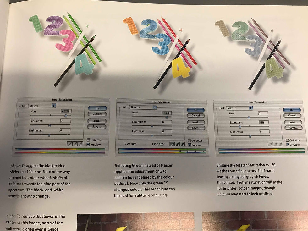
This image below shows how you can manipulate the colours of an image or layers in Photoshop to the colours of your choosing. Again, with poster creations, this can be ideal if you need to change the colours to suit the target audience.
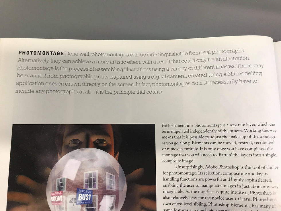
Moving onto Photo Montages, collating images together with layers in Photoshop, allows for you to make your product creative and professional. It allows for you to create multiple illusions such as this magician being able to magically show you a property for sale.

The text teaches you how to organise your layers and put the in order of what images you want to be visible. It also teaches you how to lower the opacity for the images underneath to show.

You can manipulate photographs for estate agents purposes to make the building look better than in real life. You can create an interior and exterior design of how the house looks or how you want it to look.


These images shown, demonstrate exactly how you can make a photo or illustrations with multiple layers being put in-front and behind each other. Such as the chimney, the chimney has elements that is behind the roof to make it look 3D and realistic. Or with the magician and the magic ball, Each of these illustrations was created and then put together.

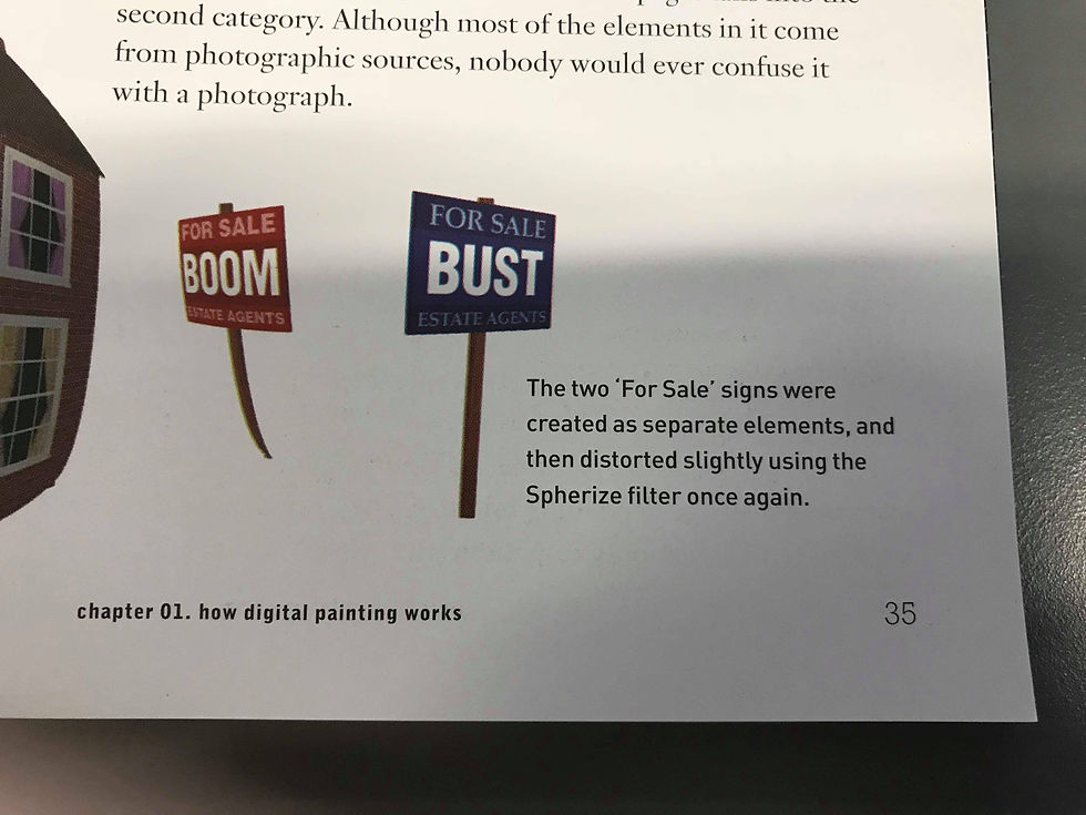
Adding textures and tilting images slightly, makes the image look even more realistic because it has depth to it. If one of the signs was not liquified, and moved, the image would not look as good as you would be able to see it is a jpg stuck on top of another image.

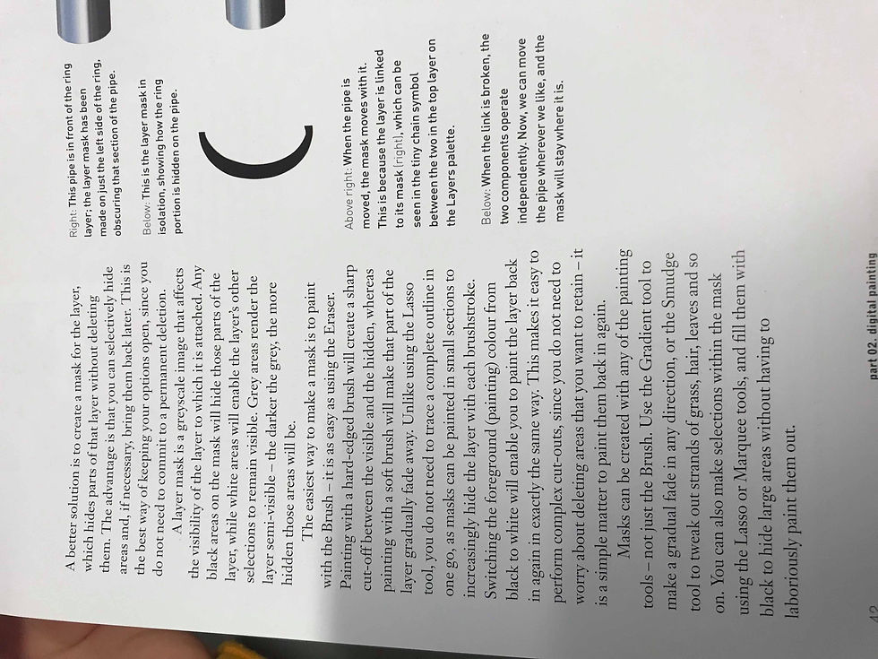
Moving onto layer masks, this is slightly more complex but the results of making masks can just make the image look that little bit more realistic and effective. The text teaches how to make your illustration or shape, put it in place and then simply use the gradient tool to give it highlight and depth. The gradient also allows the image to blend nicely with the other images and layers.
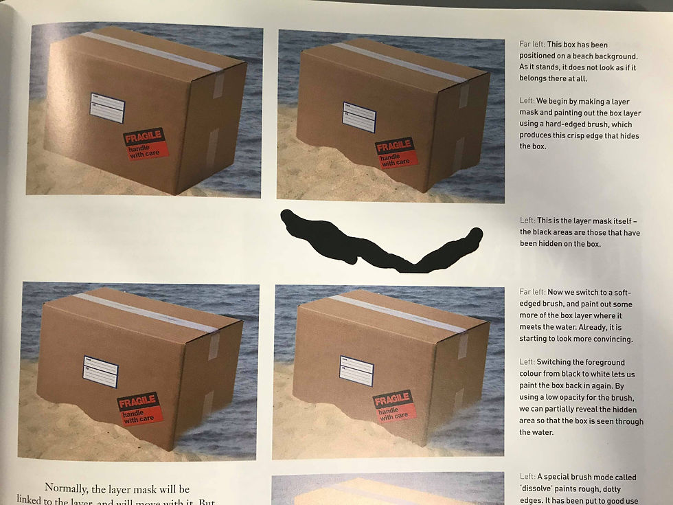
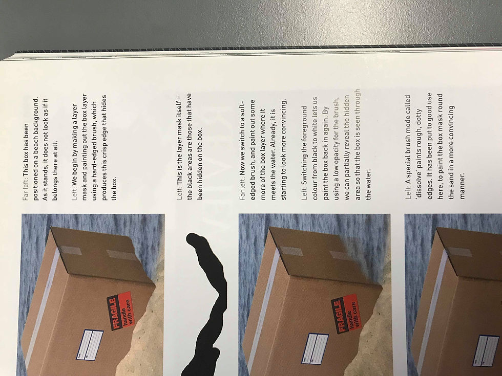
These images shows how to use layer masks in a less complicated way. You can see that the box has been put underneath the water with the water low in opacity and the sand, has been put on top of the box for the box to look like it is buried. It makes the image look somewhat realistic as we as the audience, would expect to see a bit of the box in water and some sand covering the box.
To conclude, I believe that this book has definitely helped me understand the basic of illustration and image manipulation. Manipulation is key with advertising as a lot of posters and magazines are create with images of products and models and they have been manipulated to fit with the magazine and digital product. Being able to create illustration and logos and manipulate images, allows you to already create great products within illustrator using only these basic skills.


Comments